
Contact Components
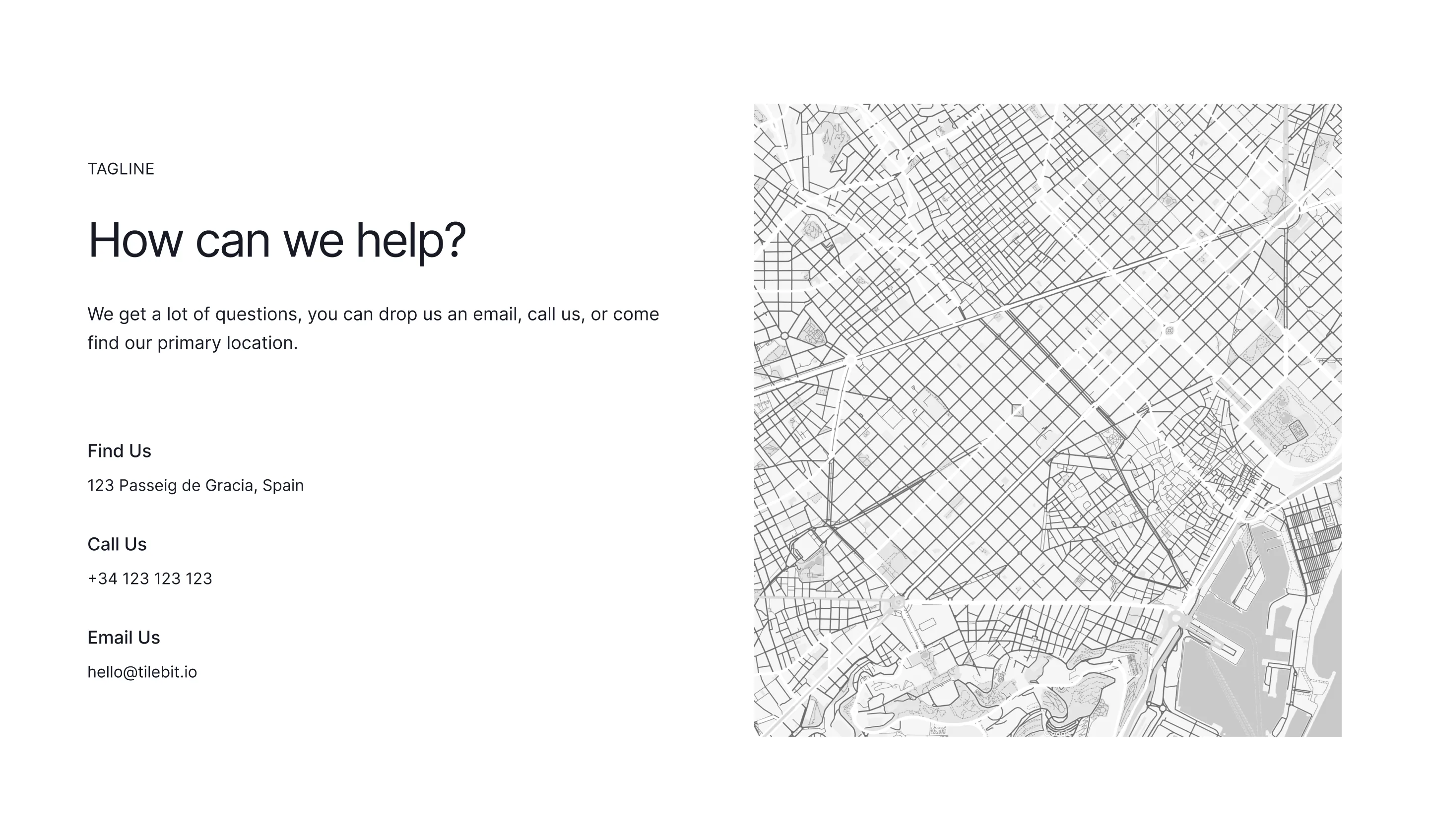
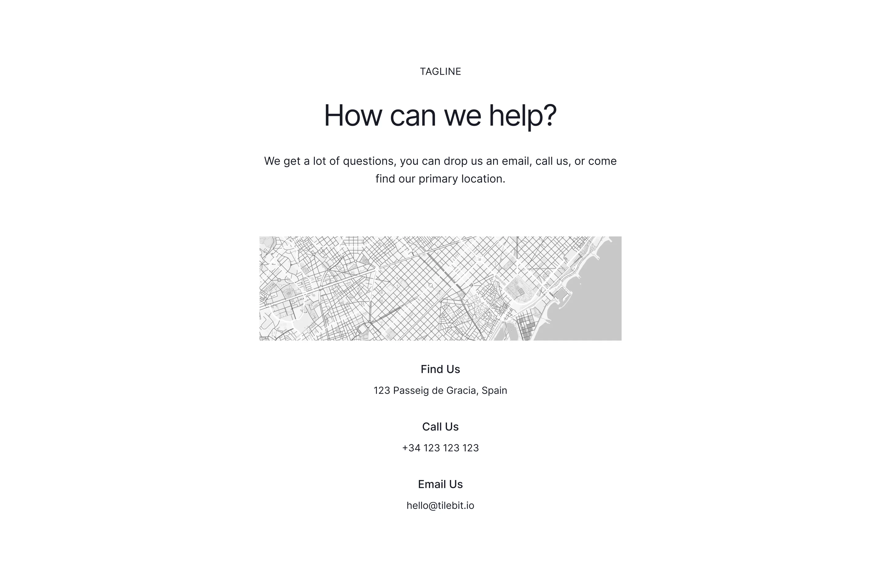
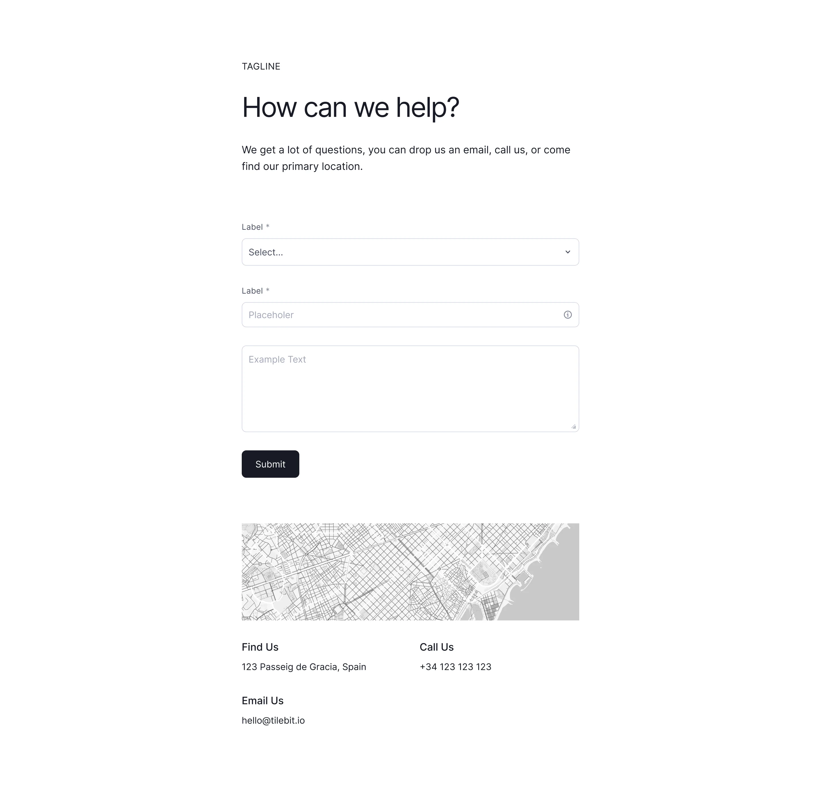
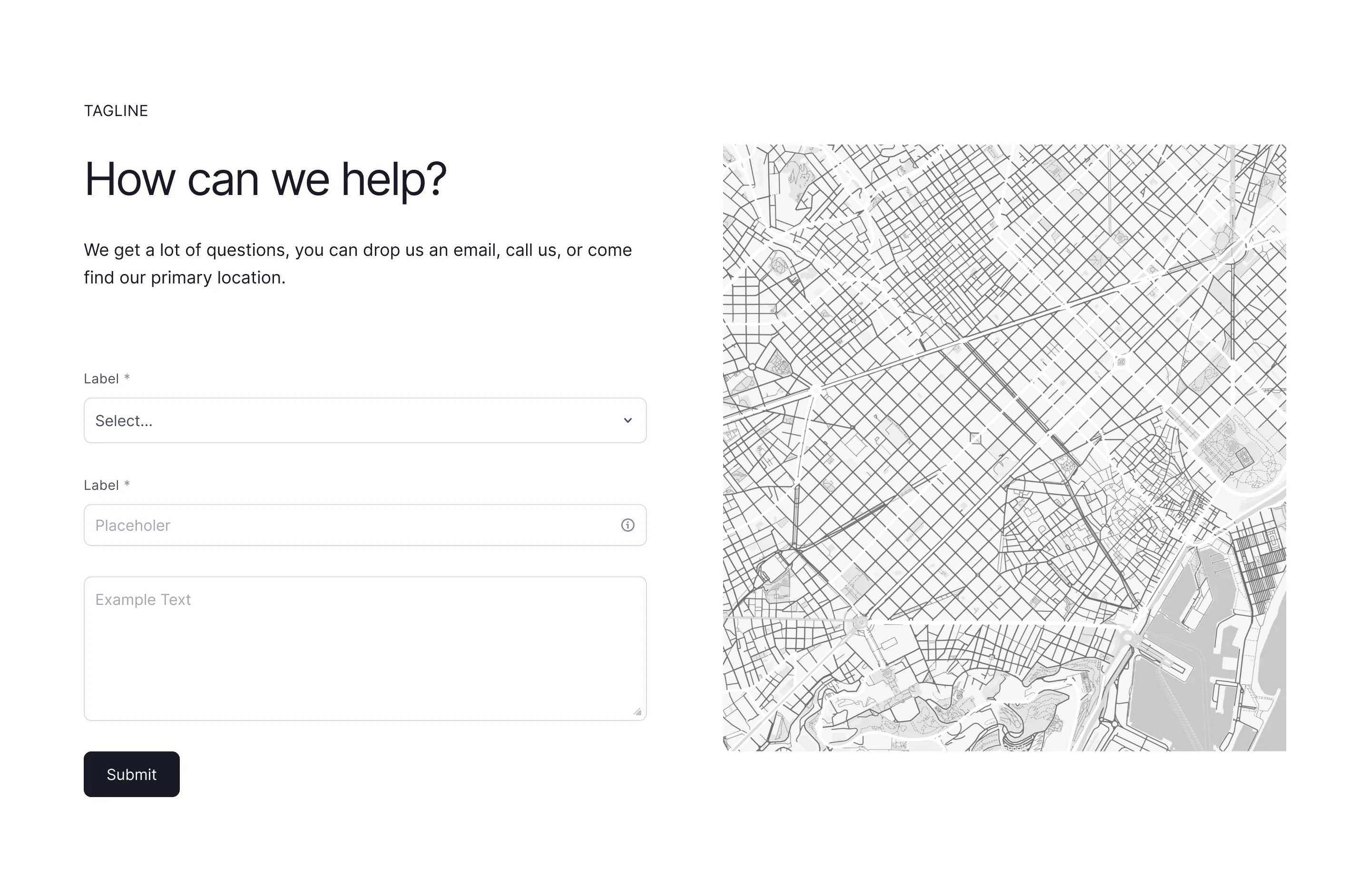
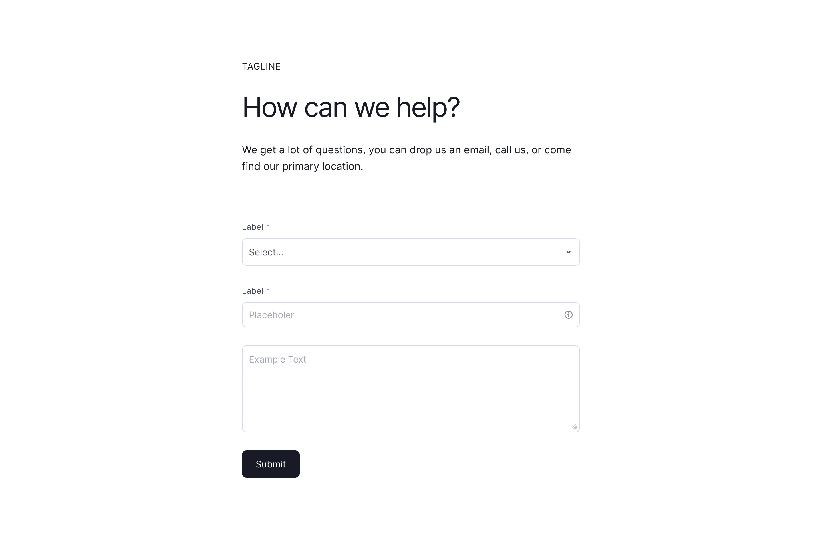
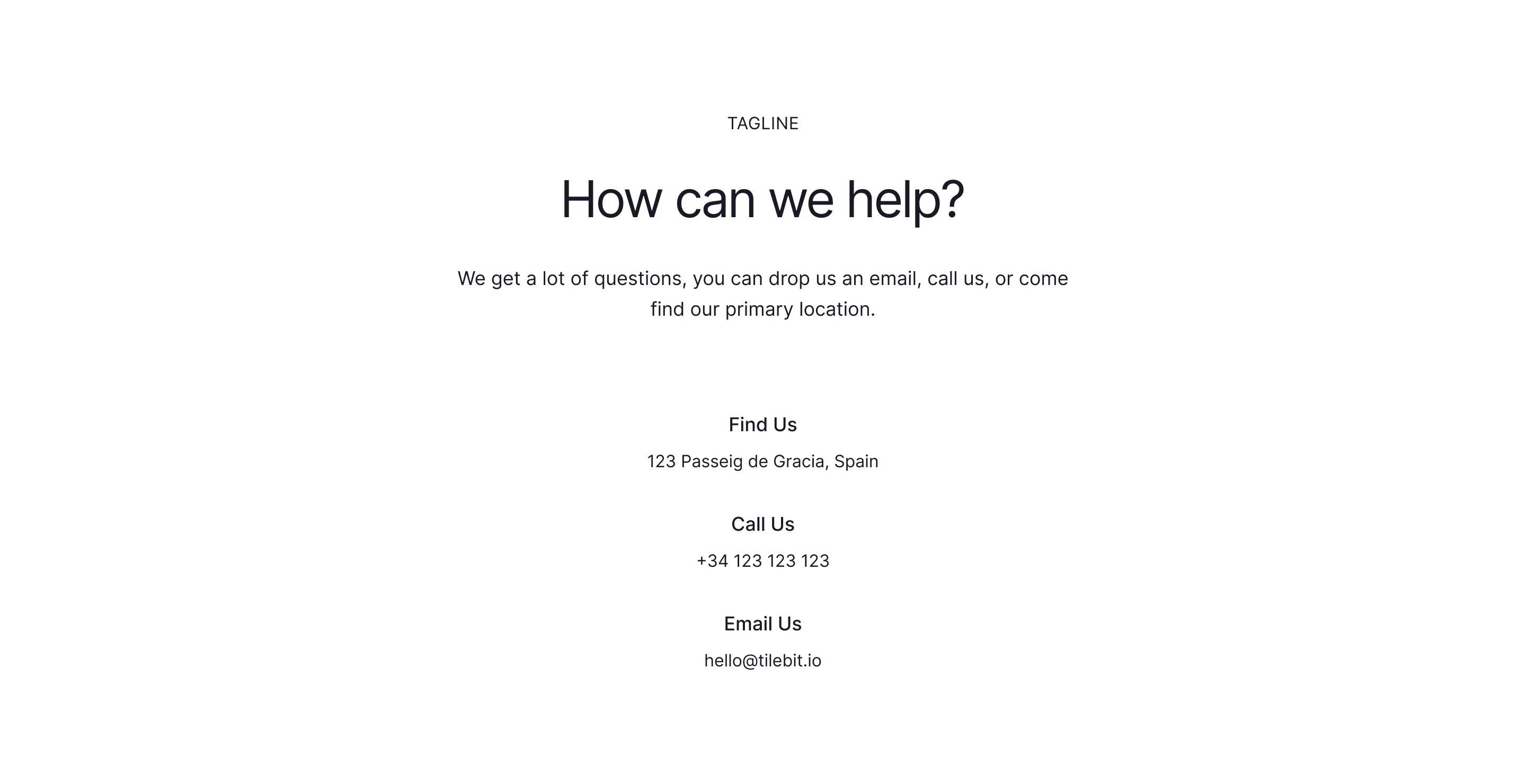
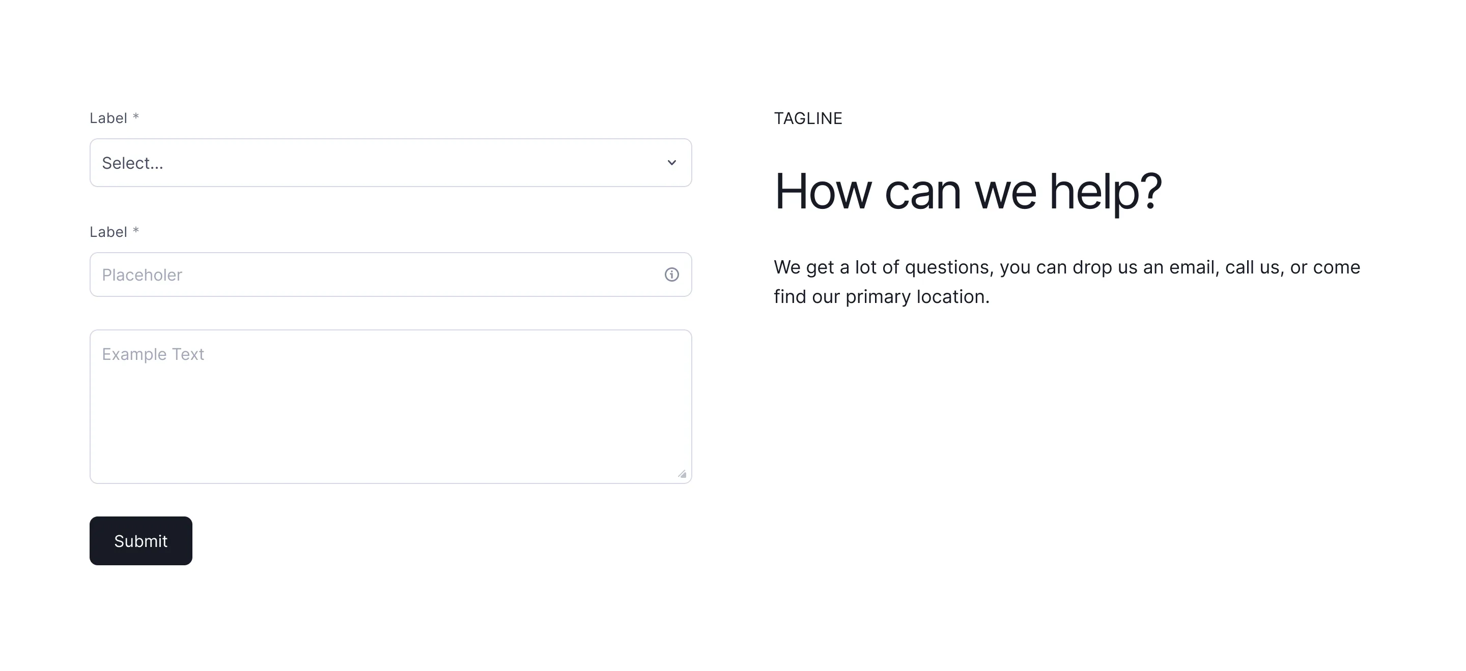
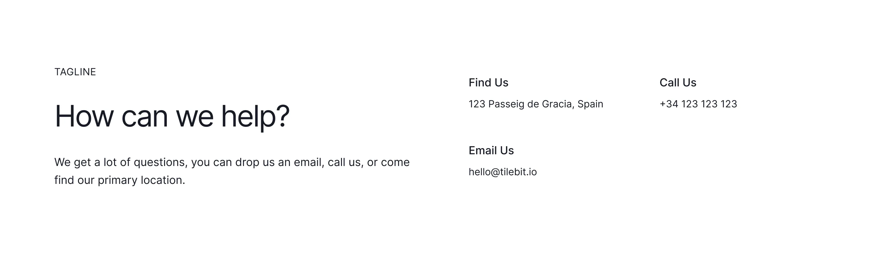
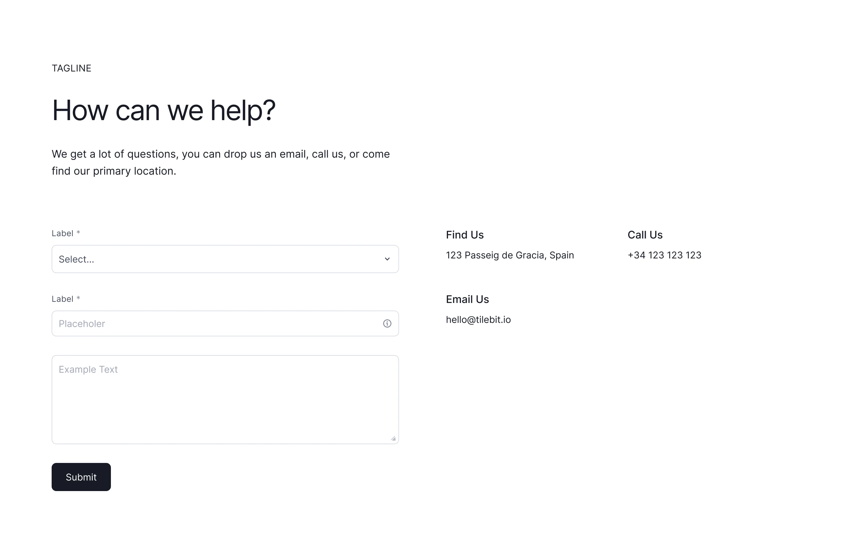
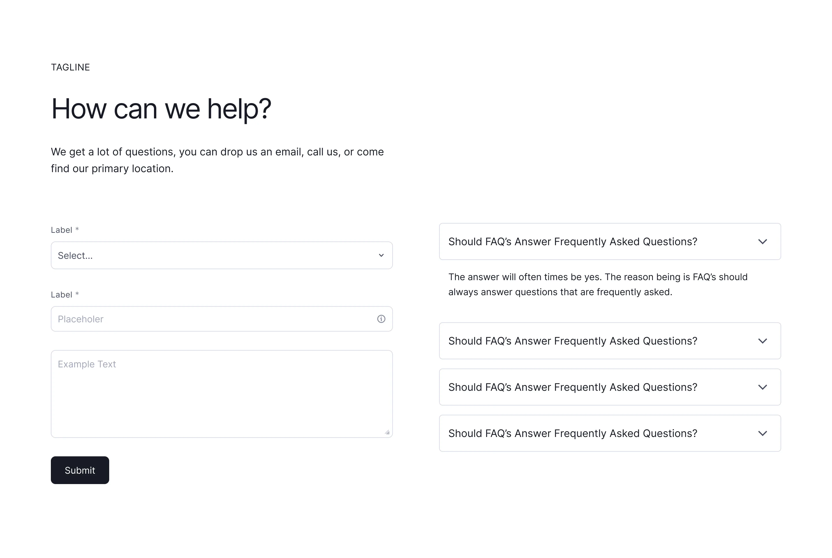
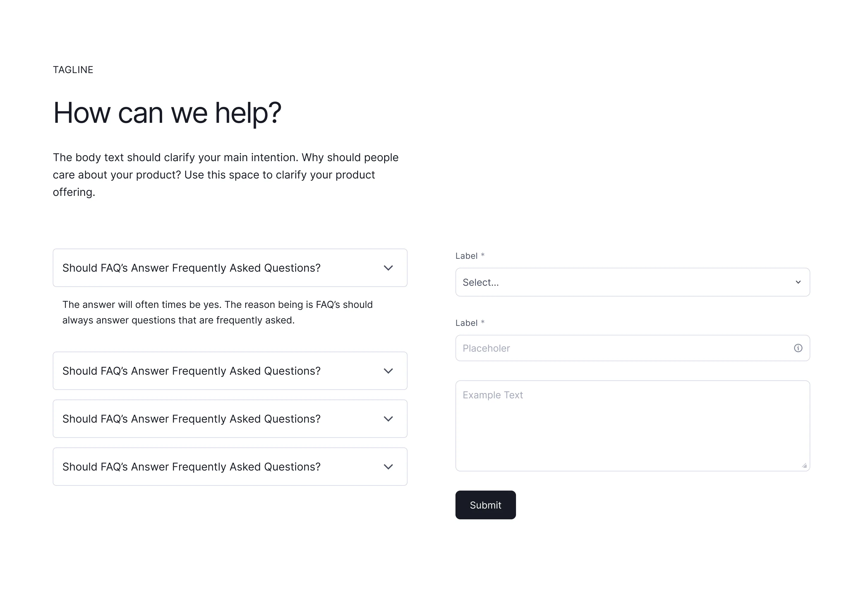
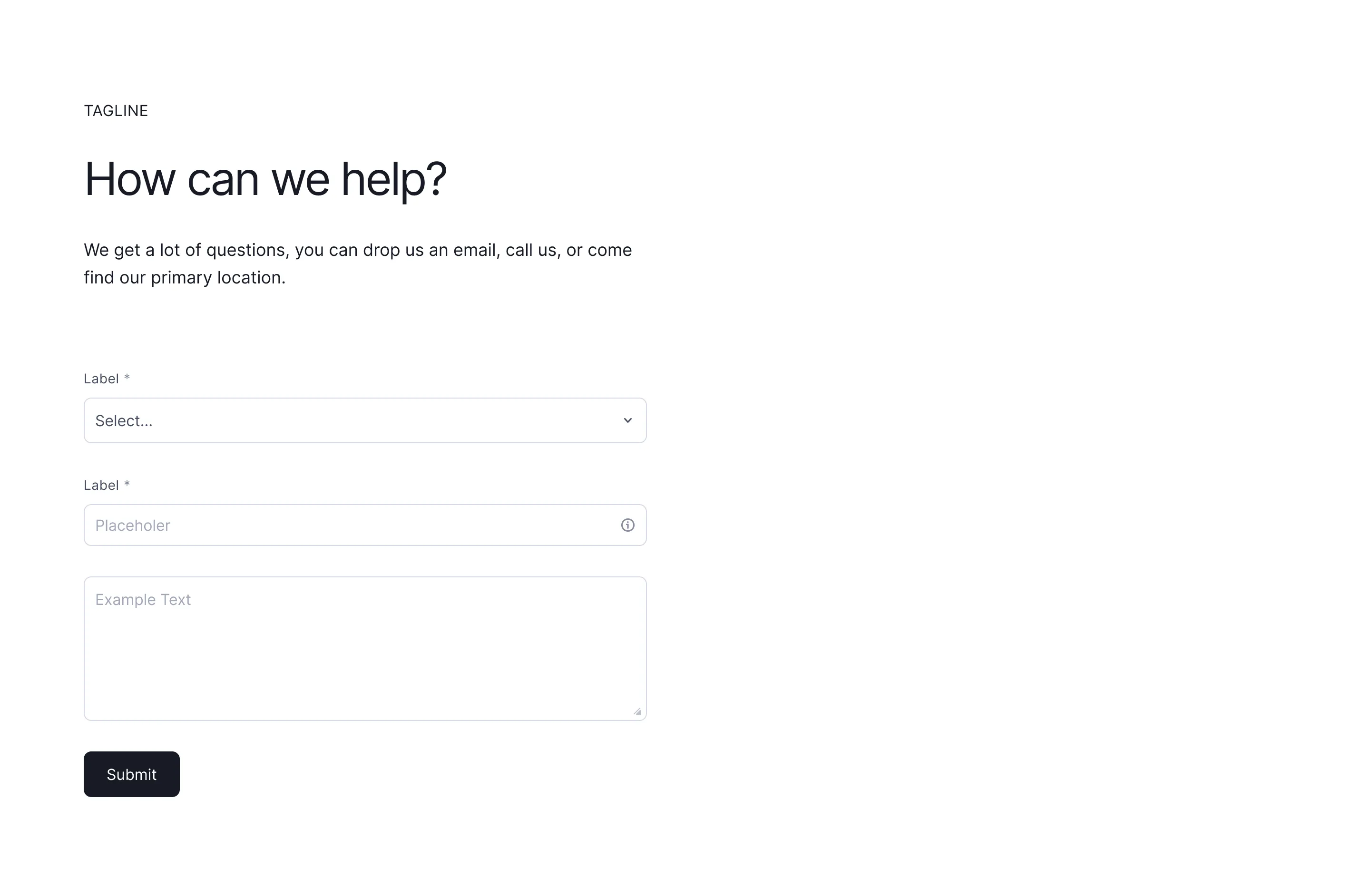
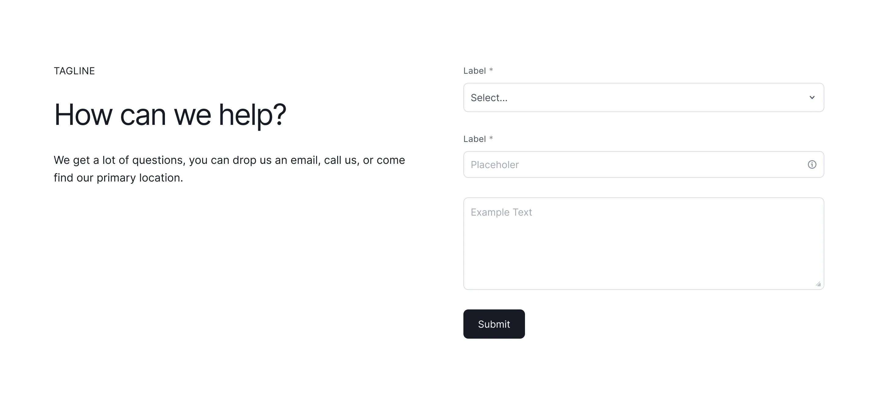
Contact form and contact section wireframes with sensible field groupings, ready to duplicate into Figma, Framer, or Webflow.



Contact section patterns that get replies
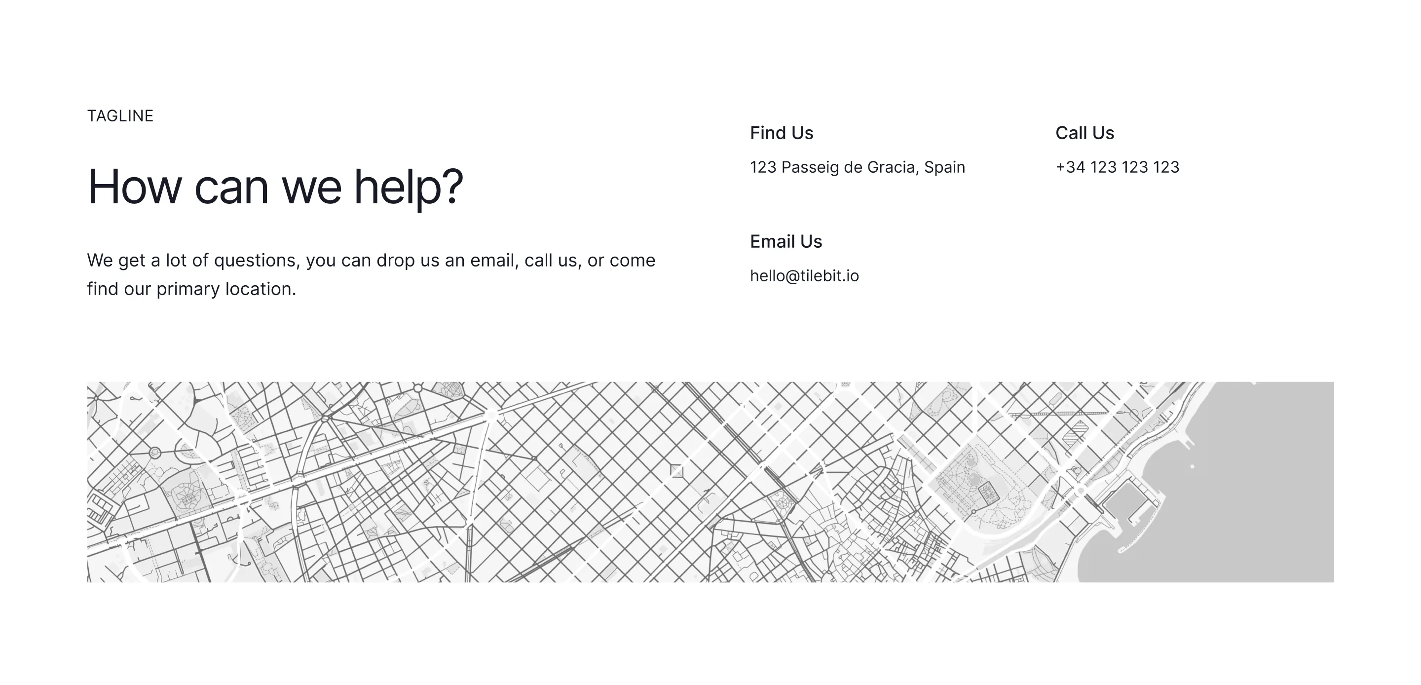
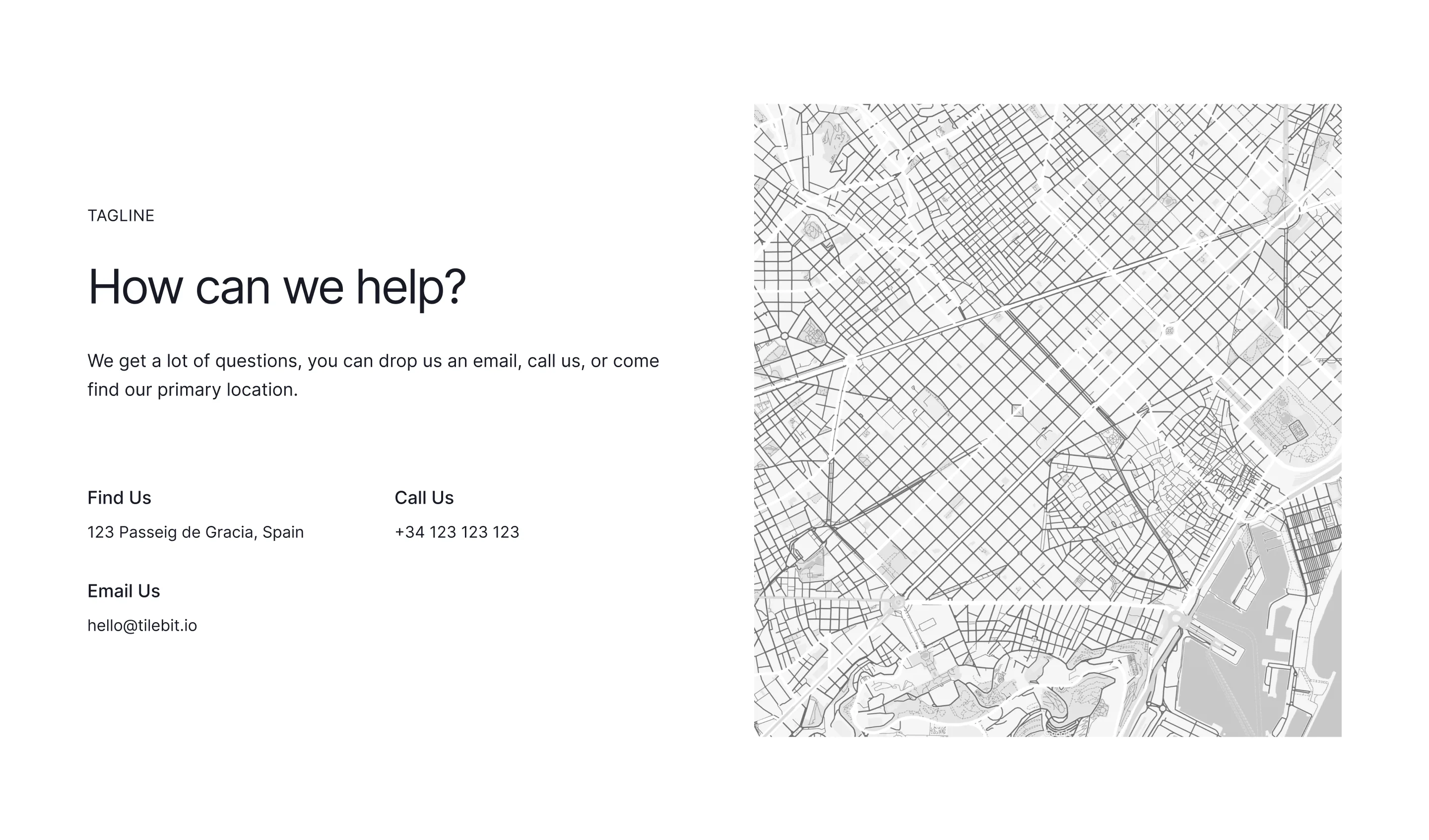
A contact section earns replies by removing friction: fewer form fields, a visible email address for people who hate forms, and a line about response time. Adding a map, an office photo, or a real person's name raises trust and completion rates more than any styling change.
Browse the contact wireframes above and copy any of them to Figma, Framer, or Webflow. The layouts cover split form-plus-details, centred minimal forms, and multi-office grids, each with sensible field groupings you can trim down to only what you actually need to ask.
One practical rule: every field you add costs submissions. Name, email, and message cover most sites. If sales needs more qualification, ask for it in the reply, not the form, and route support and sales to different inboxes so nothing sits unanswered.