
CTA Component
Call-to-action section layouts built around a single clear ask, ready to copy into Figma, Framer, or Webflow and fill with your offer.





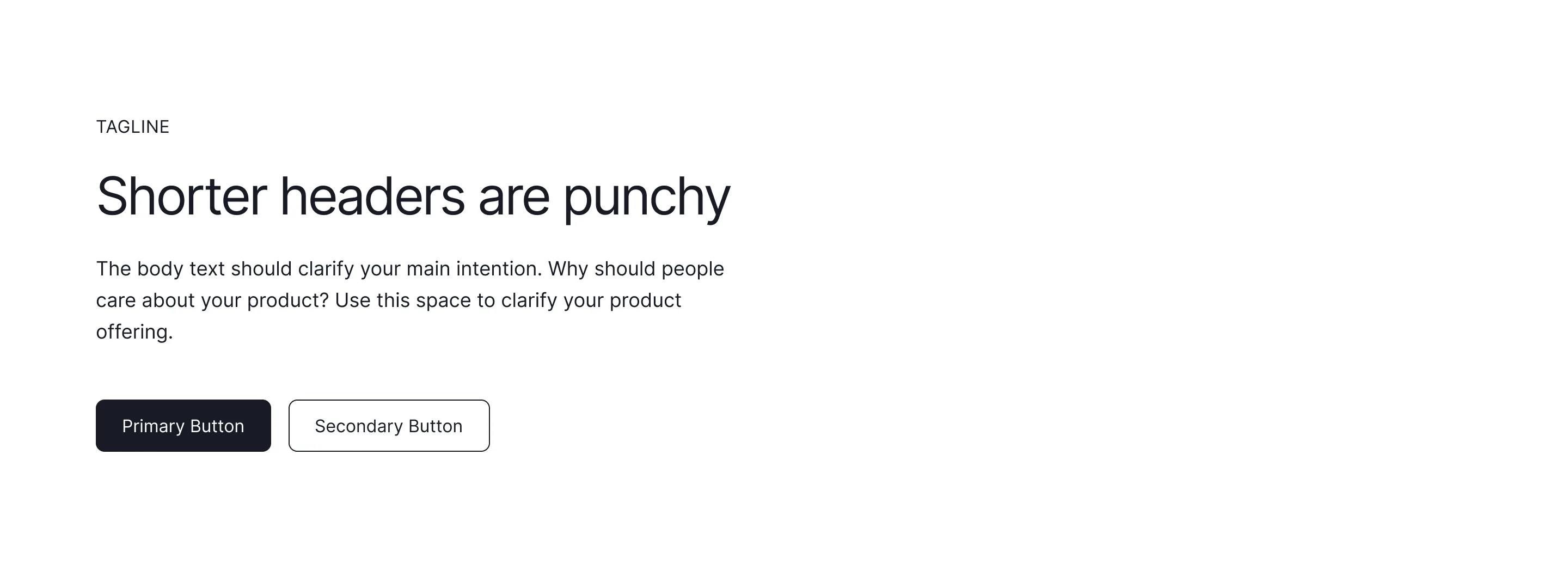

Call-to-action sections that close the page
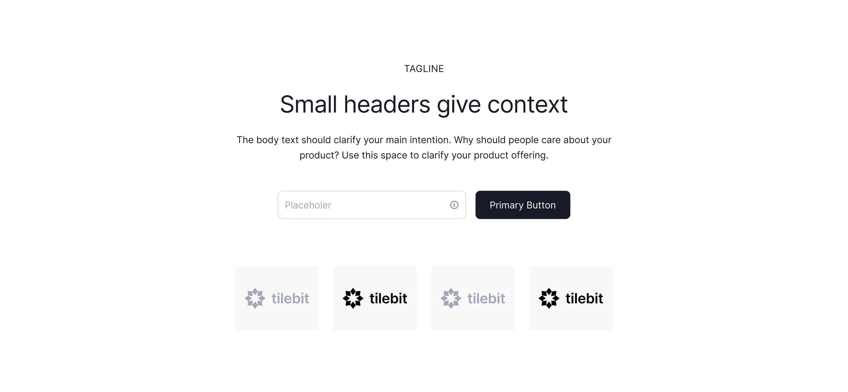
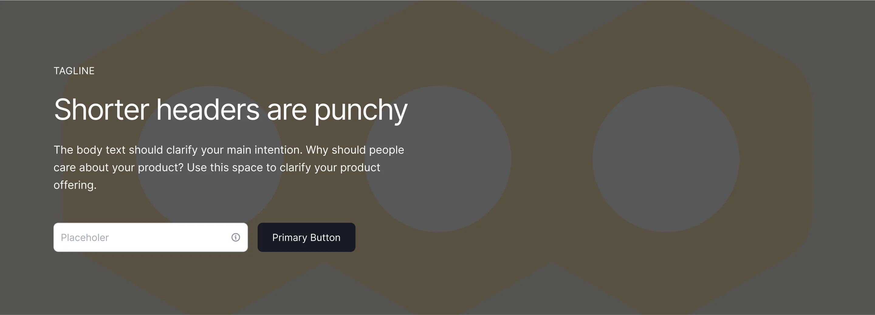
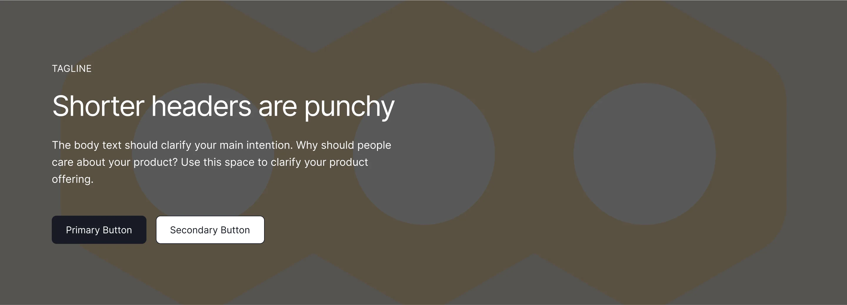
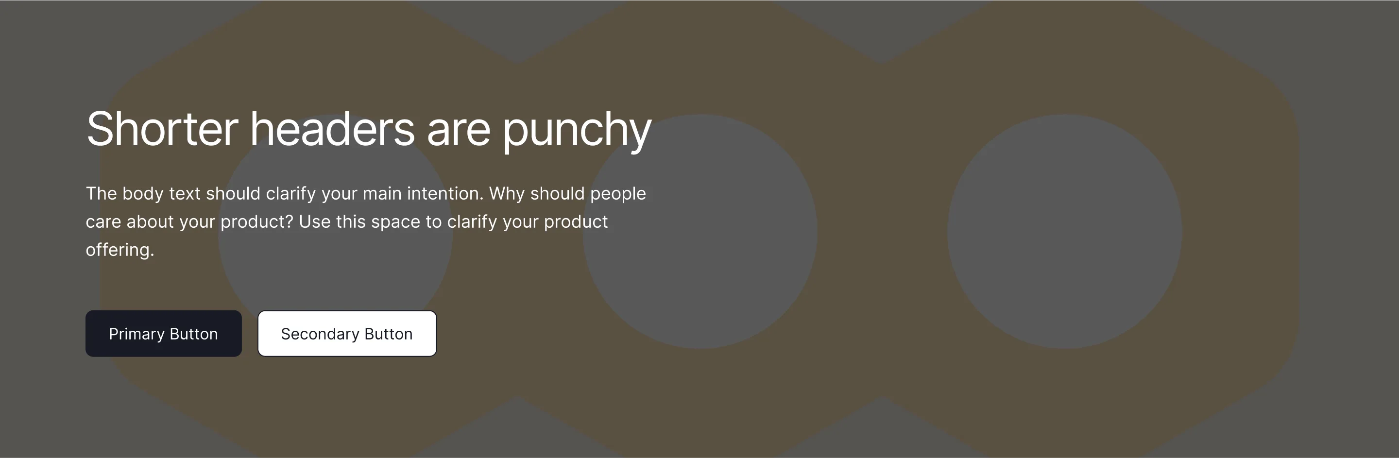
A CTA section is the last push before the footer, the place where a page's argument turns into a click. The strongest ones make a single ask, repeat the core value proposition in the heading, and use whitespace and contrast rather than size to stand out.
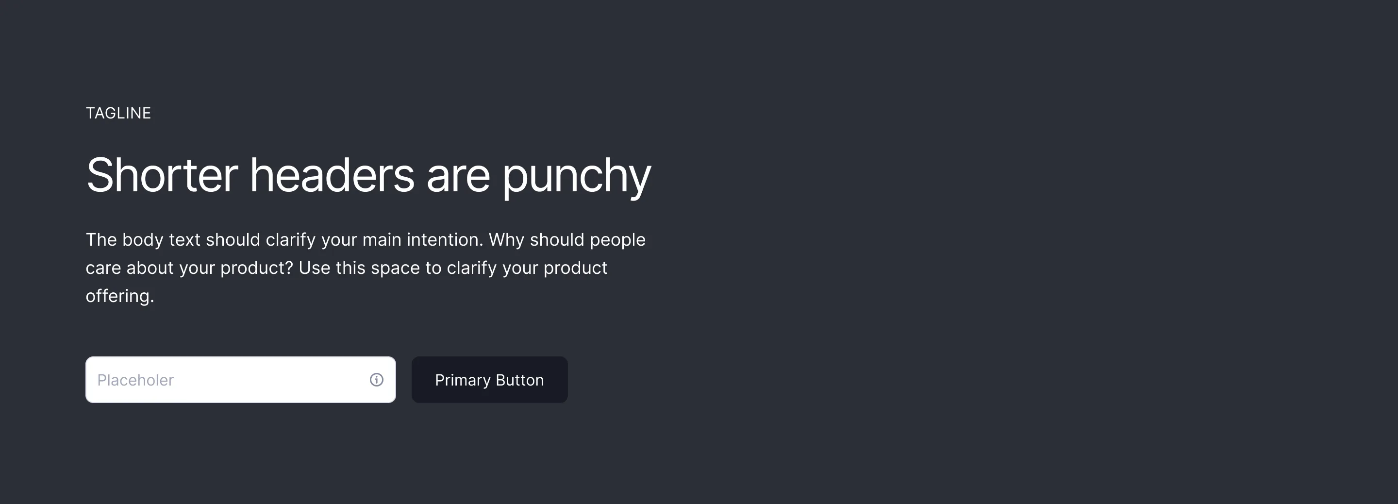
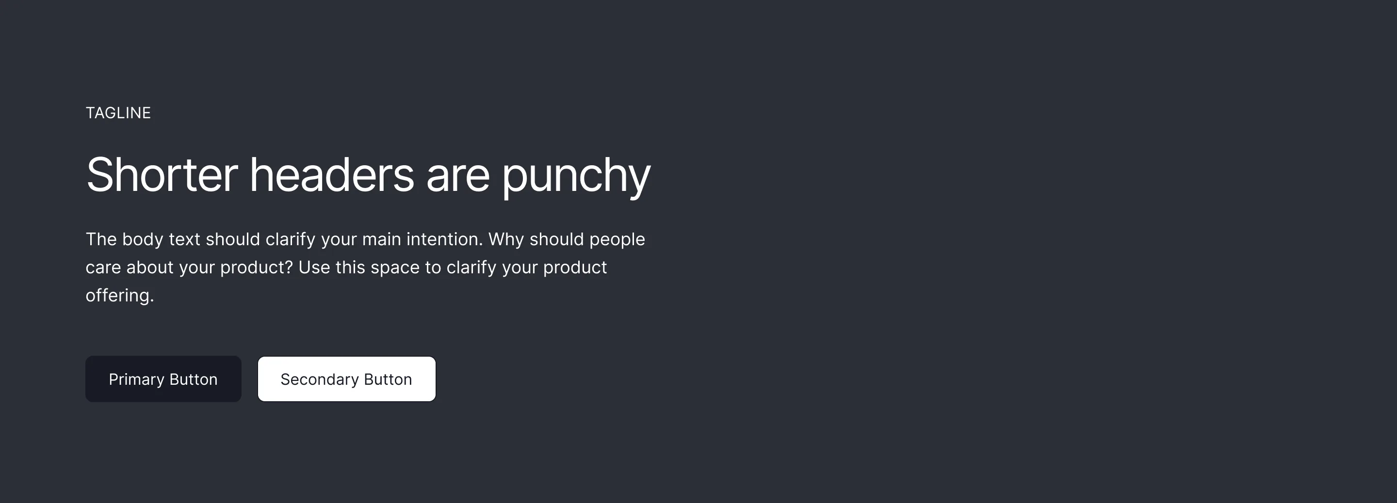
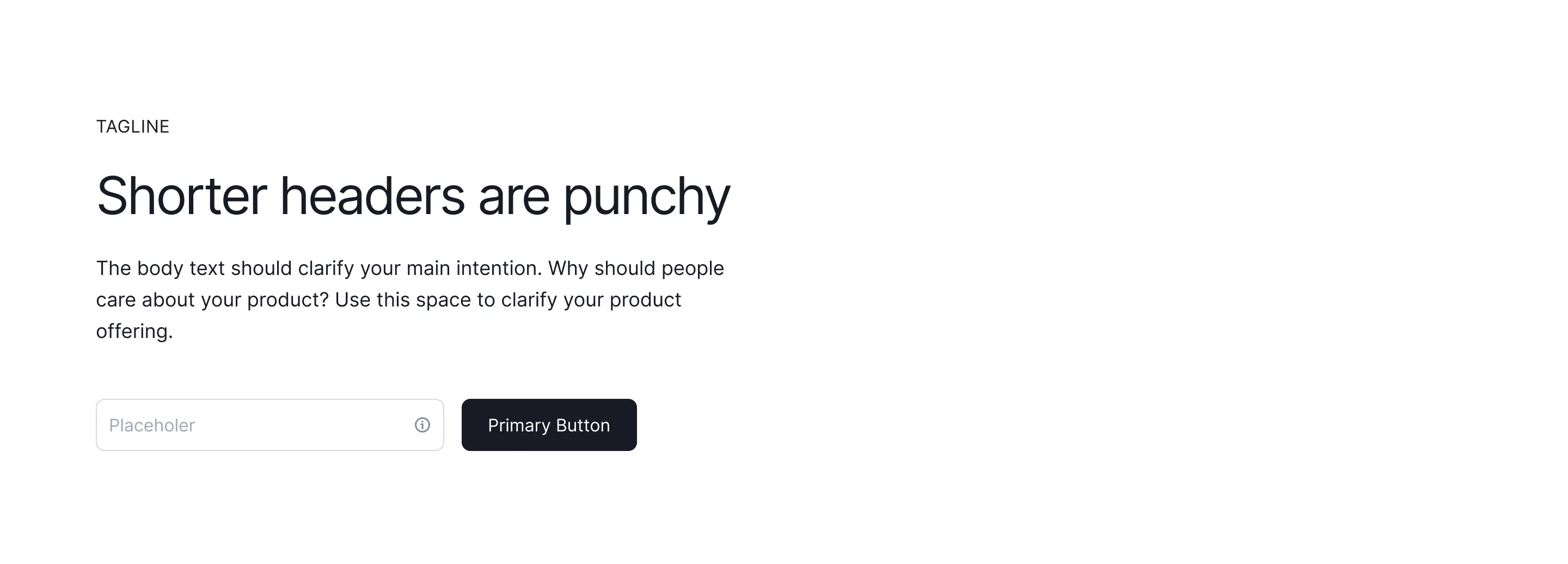
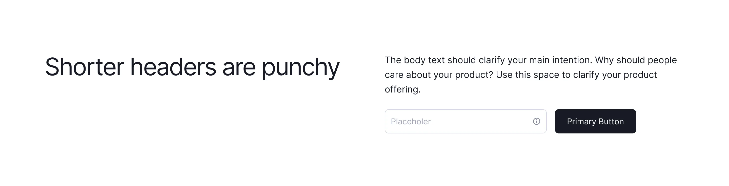
Every CTA component here is a wireframe you can drop into Figma, Framer, or Webflow. Pick from centred banners, split layouts with product shots, and full-width panels, then swap the copy for your own offer and keep the one button that matters.
On long pages, repeat the CTA rather than making one section shout louder: once after the hero, once mid-page, once at the end. Keep the button text identical each time so the action feels like one decision, not three different asks.