
Pricing Components
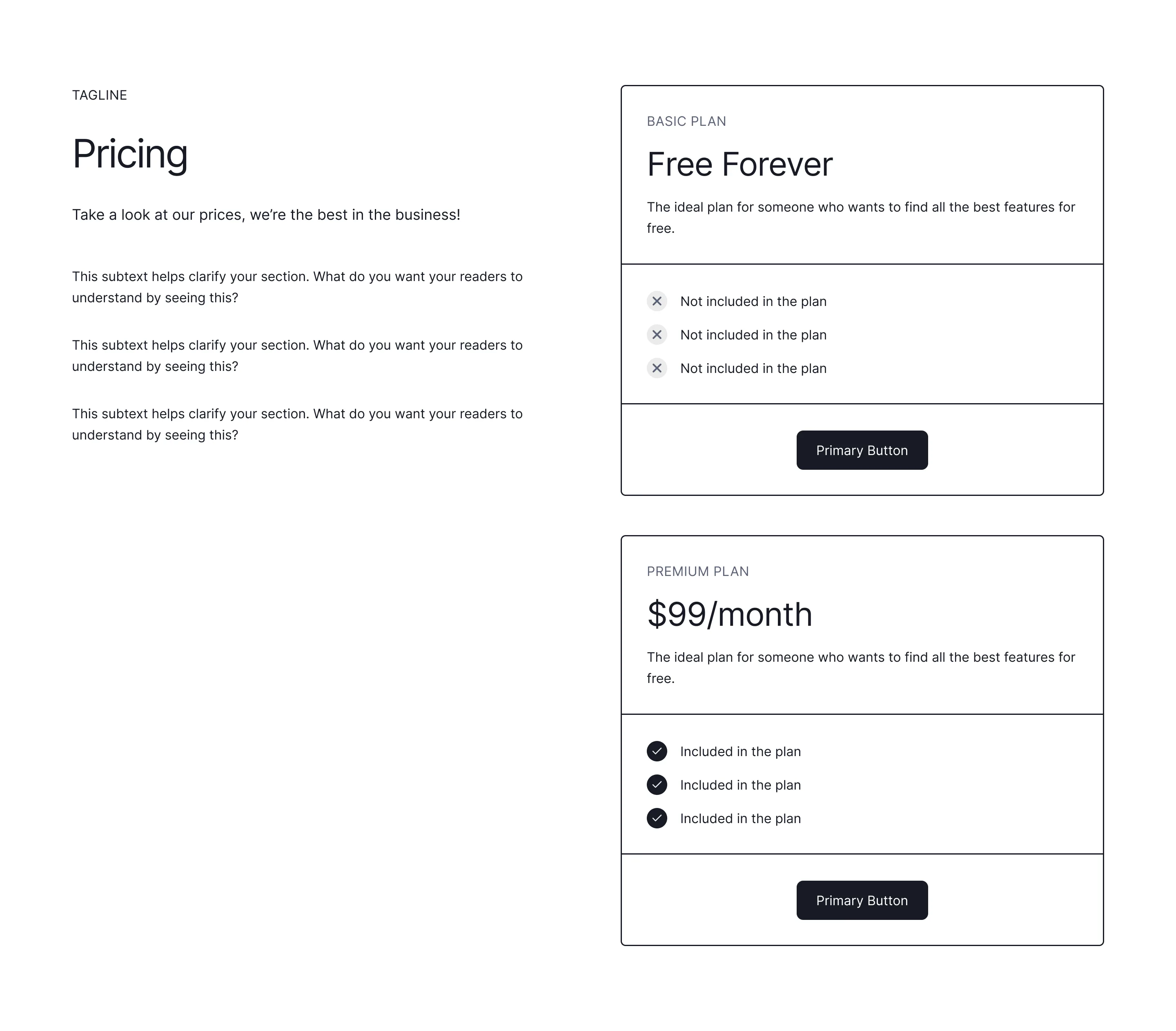
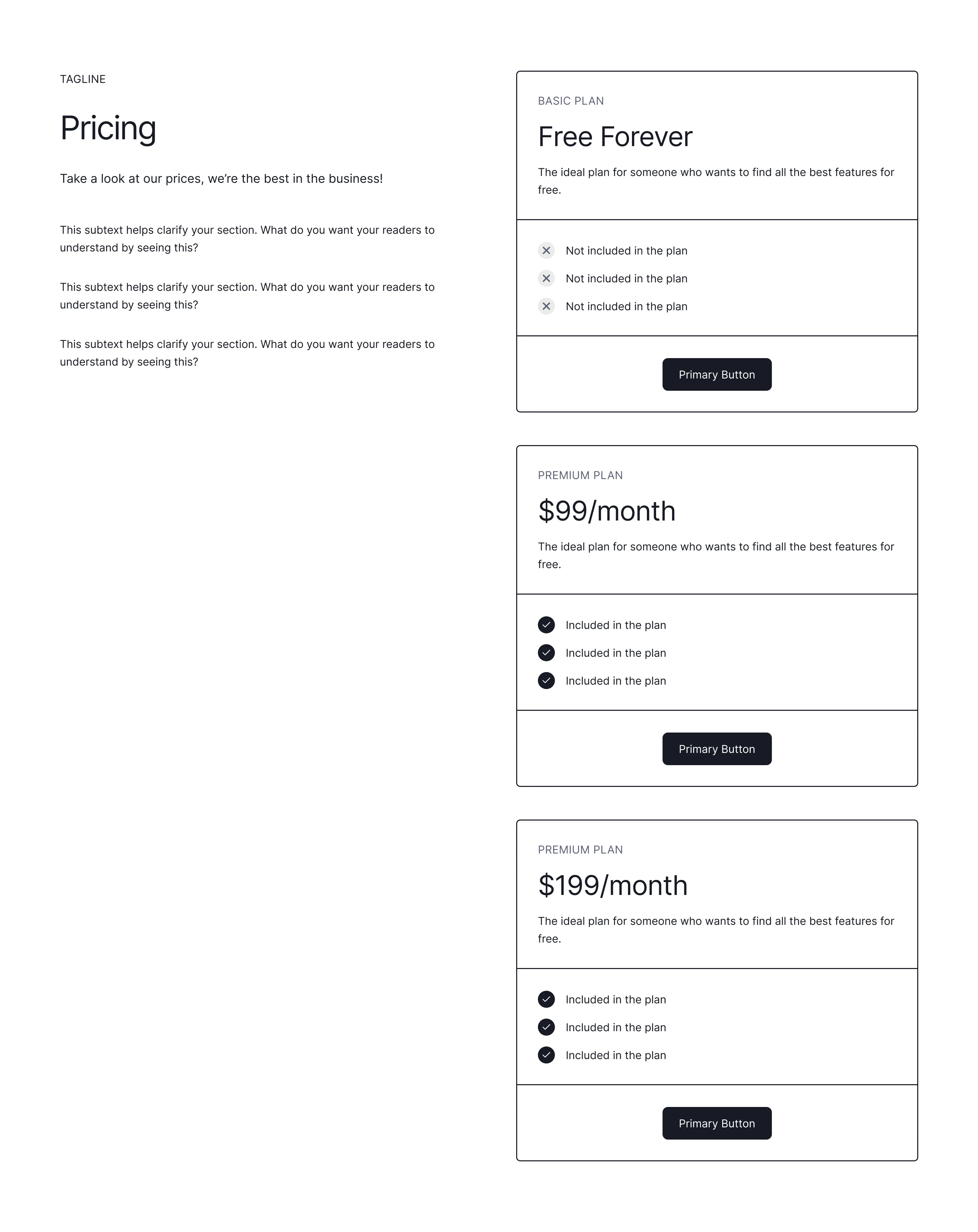
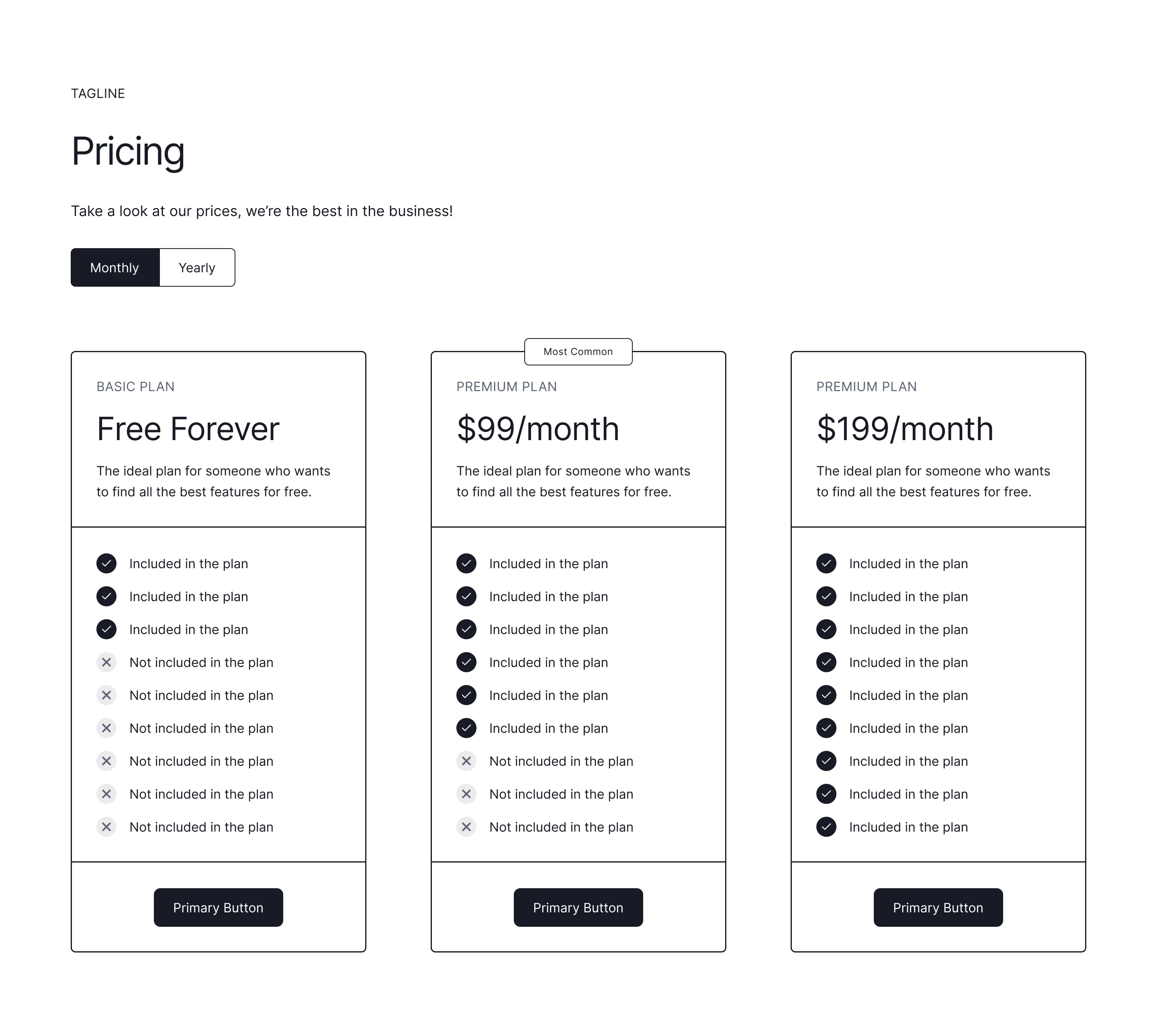
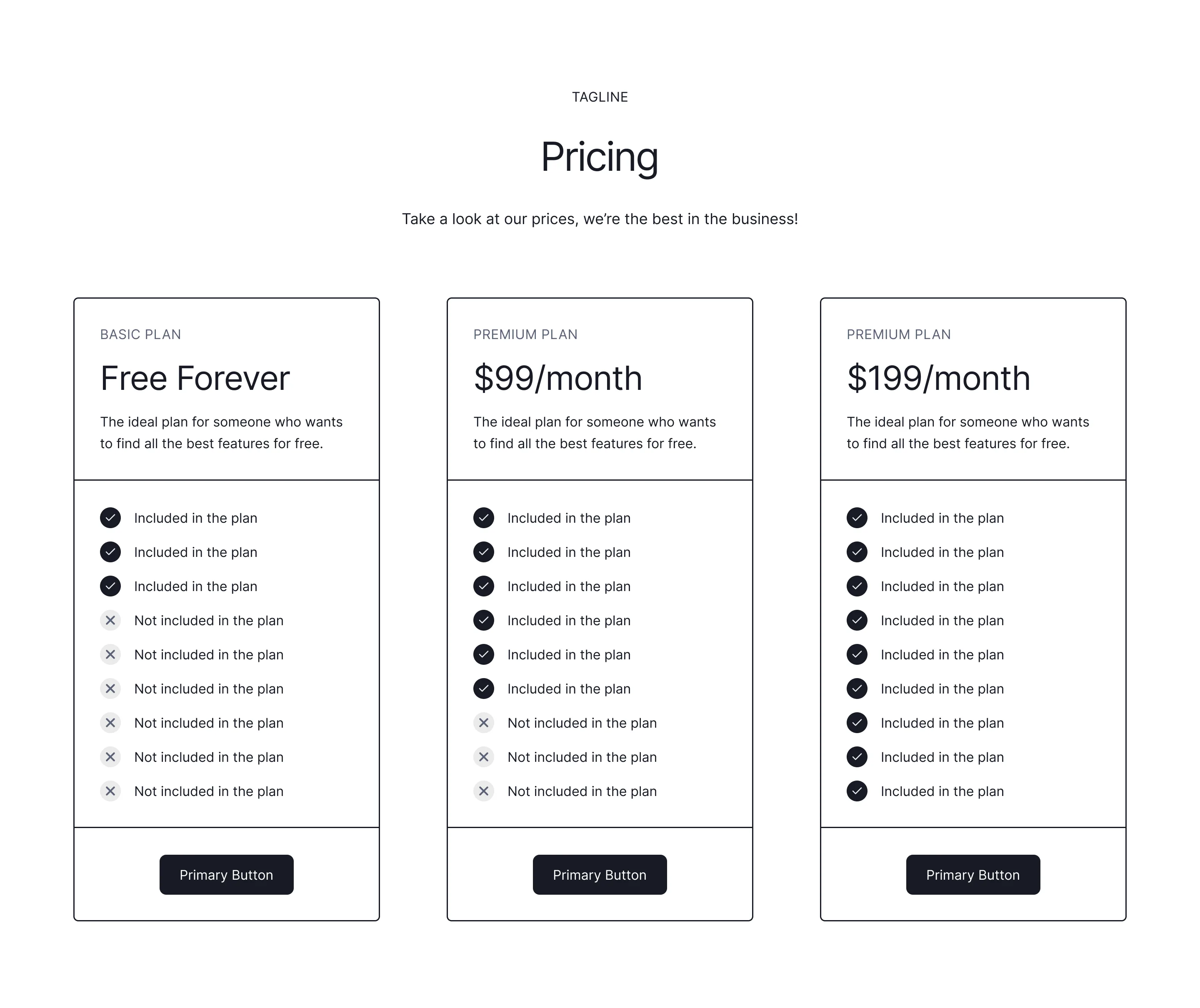
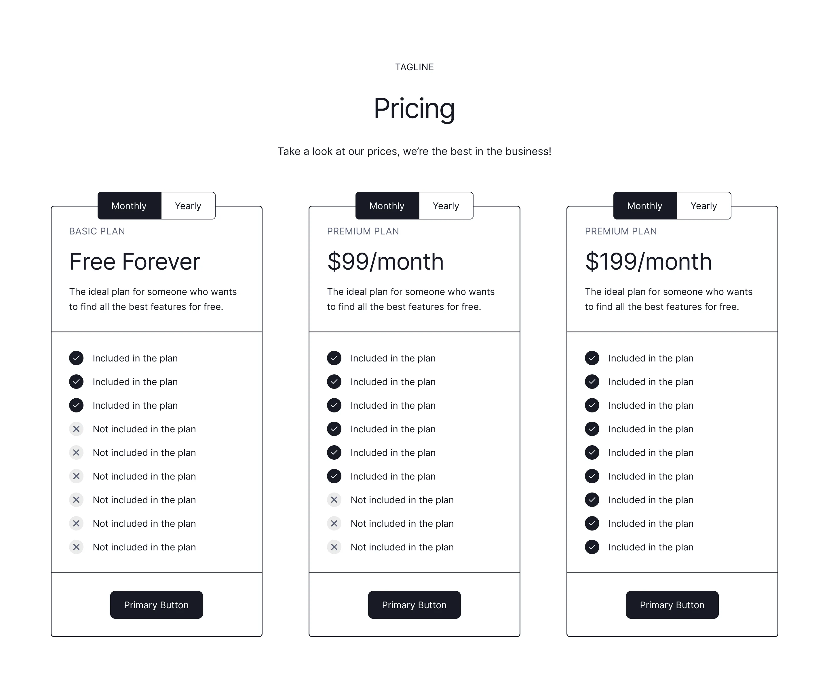
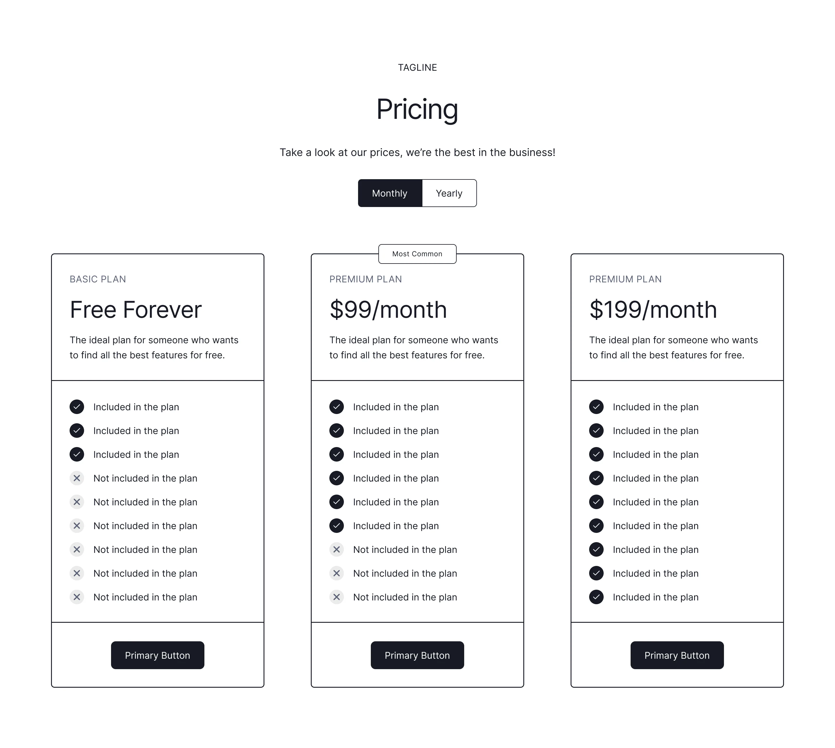
Pricing cards, comparison tables, and toggle layouts with emphasis worked out, ready to duplicate into Figma, Framer, or Webflow.

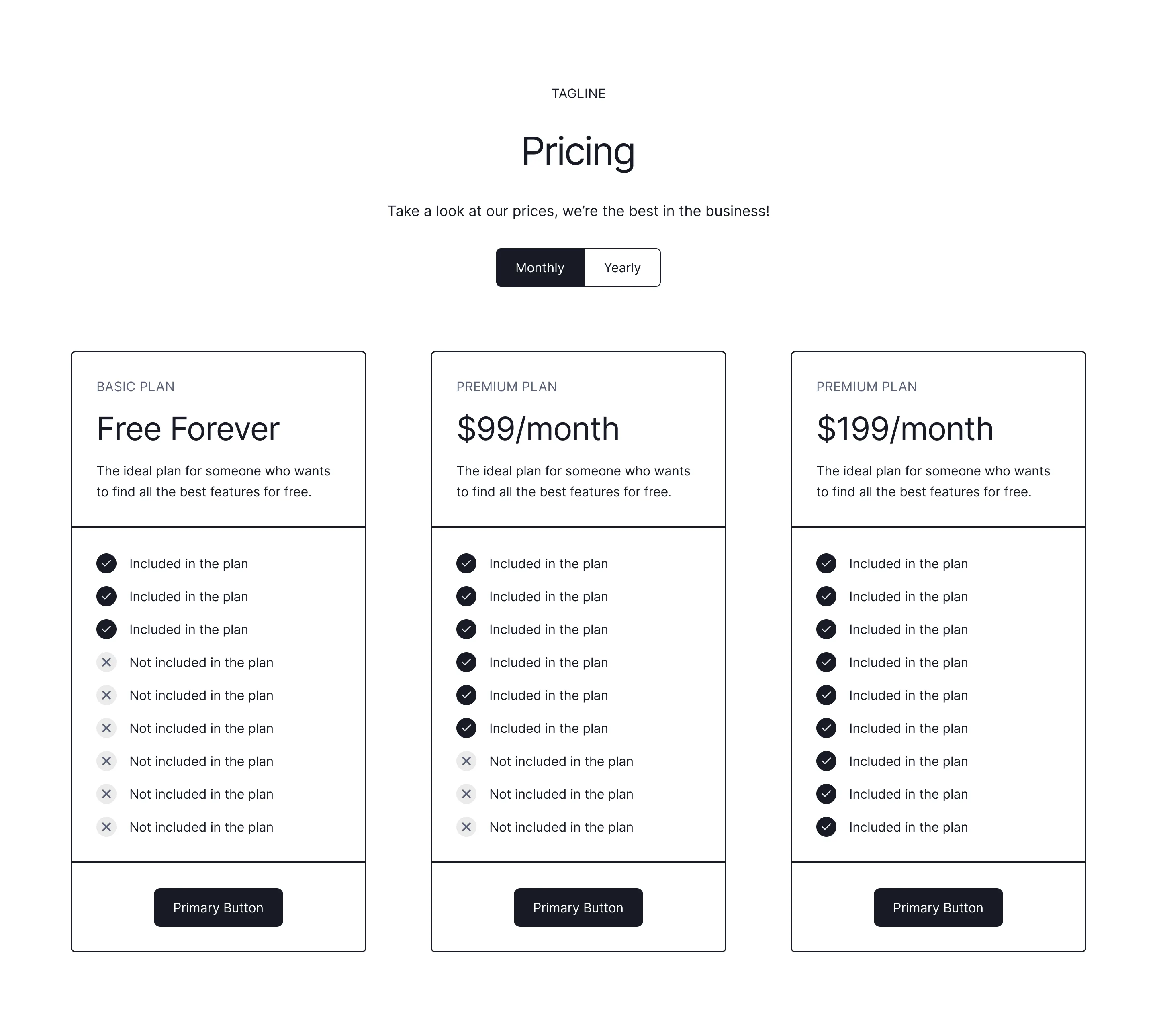
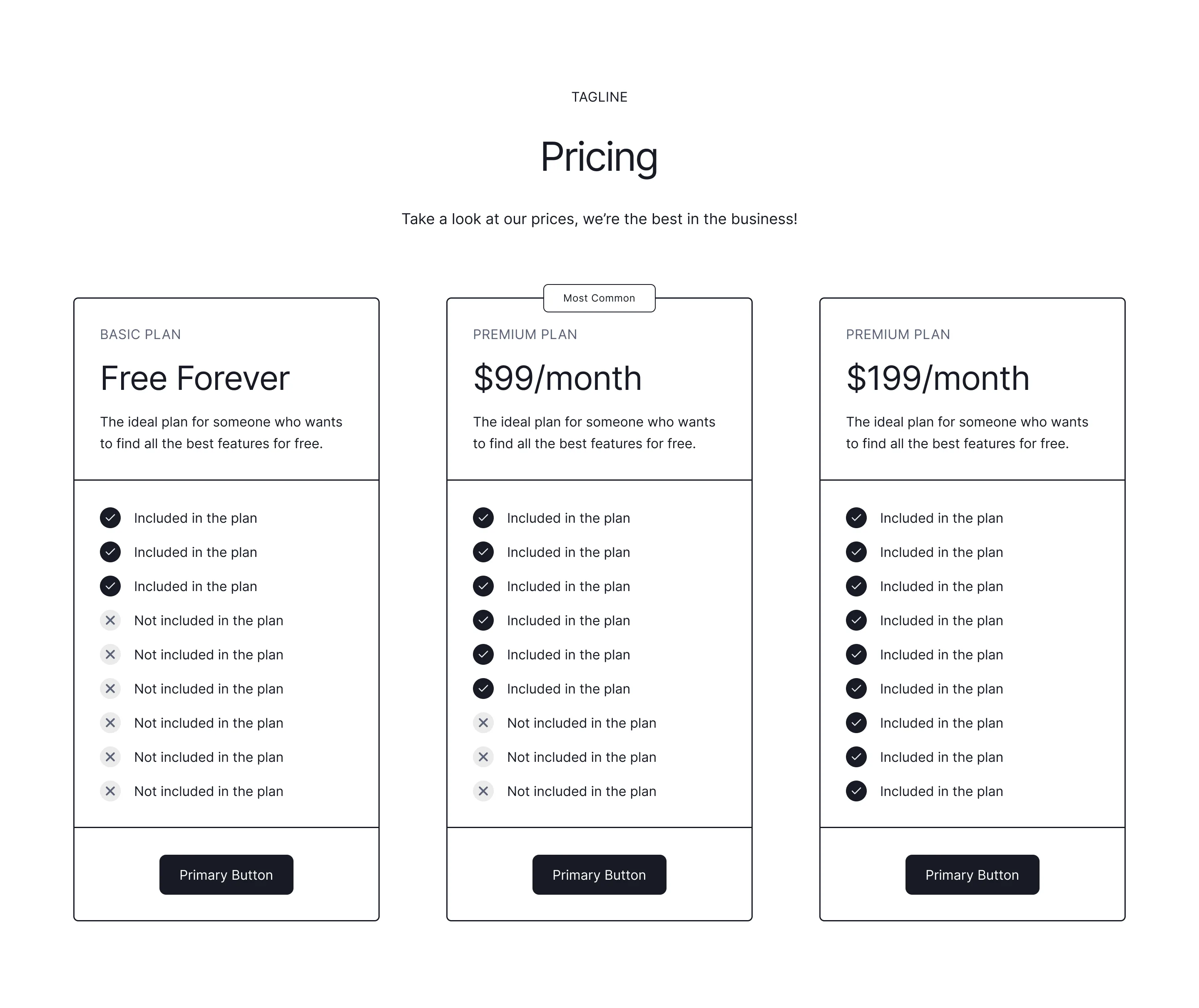
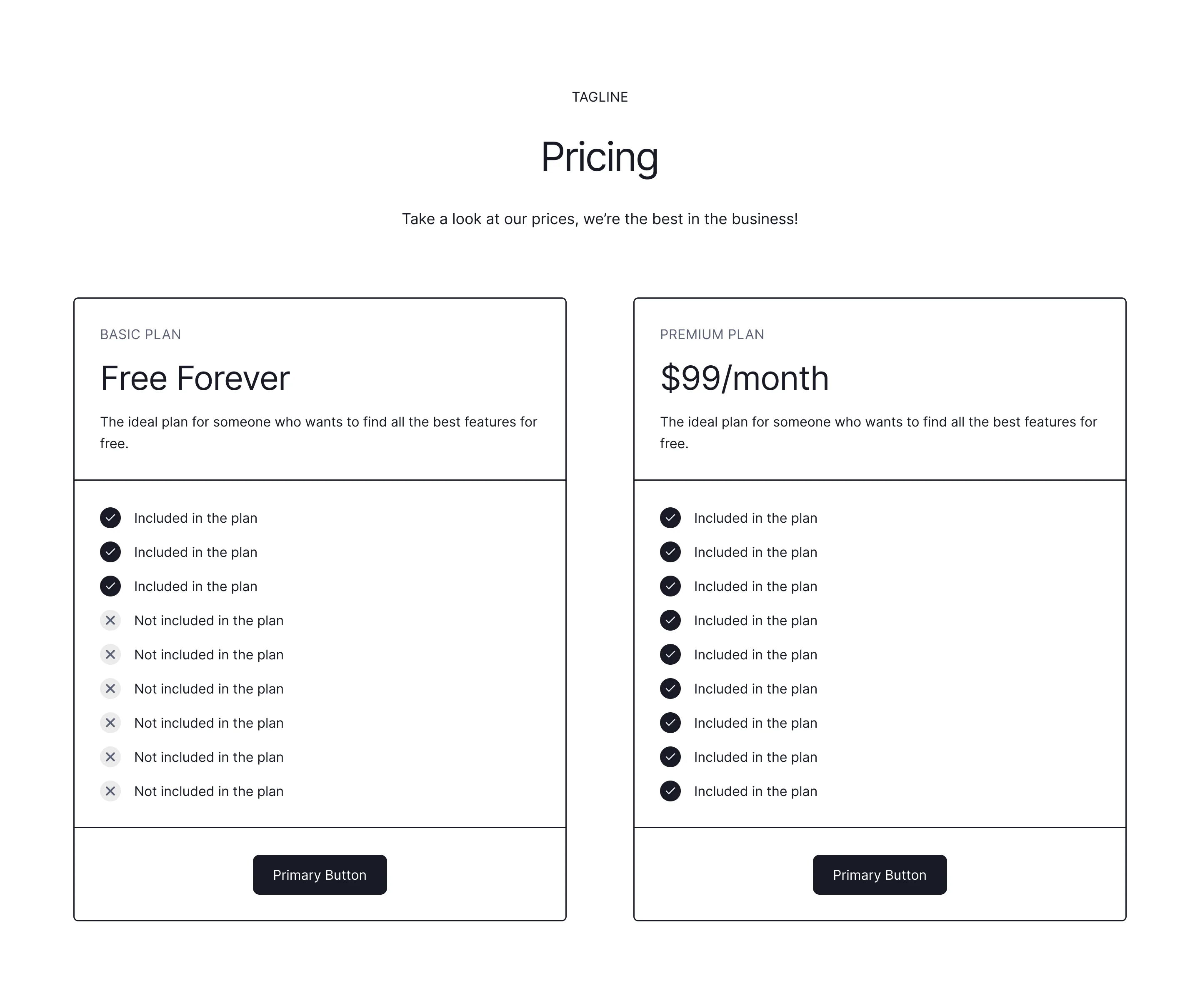
Pricing table design that reduces hesitation
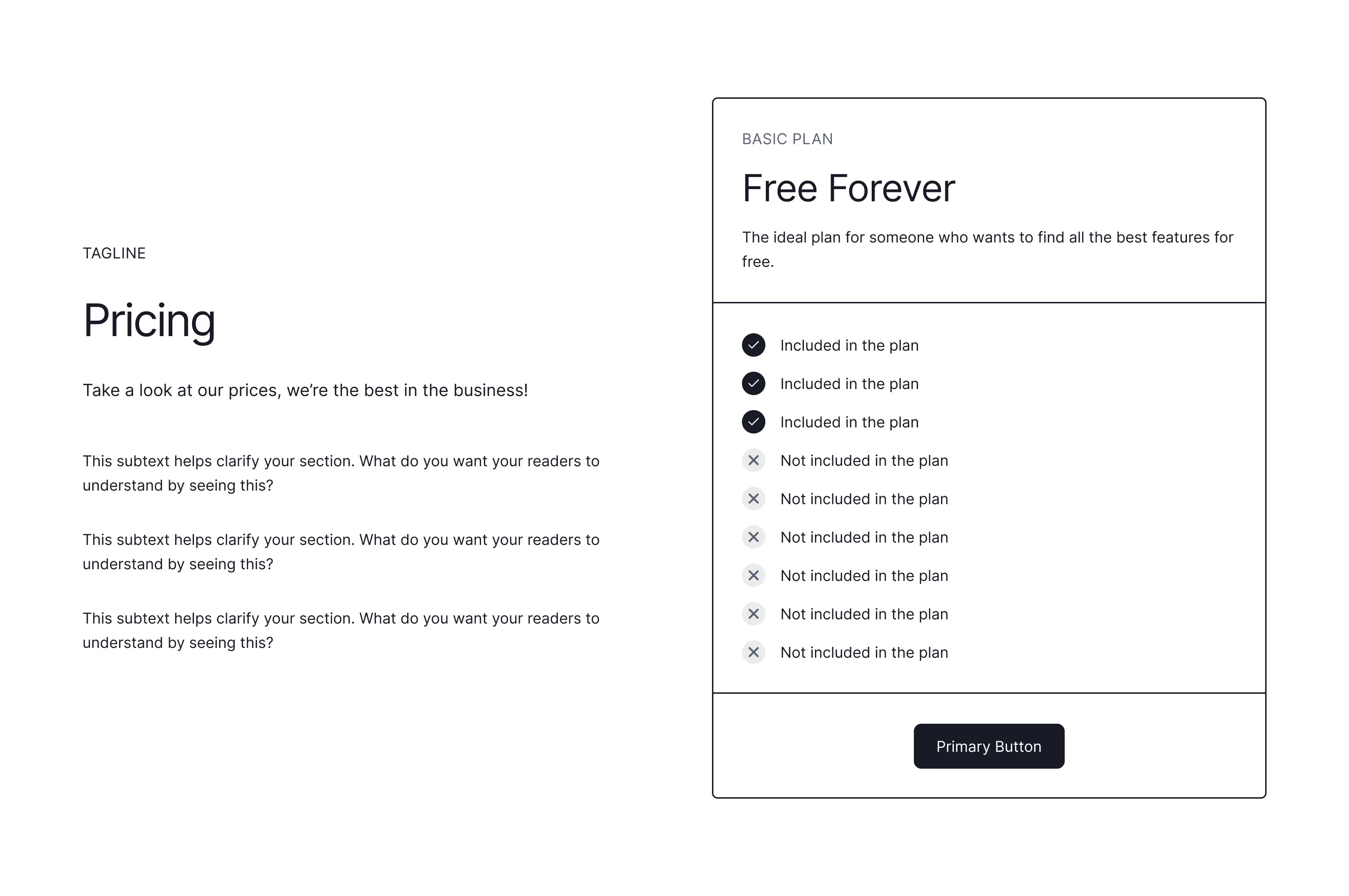
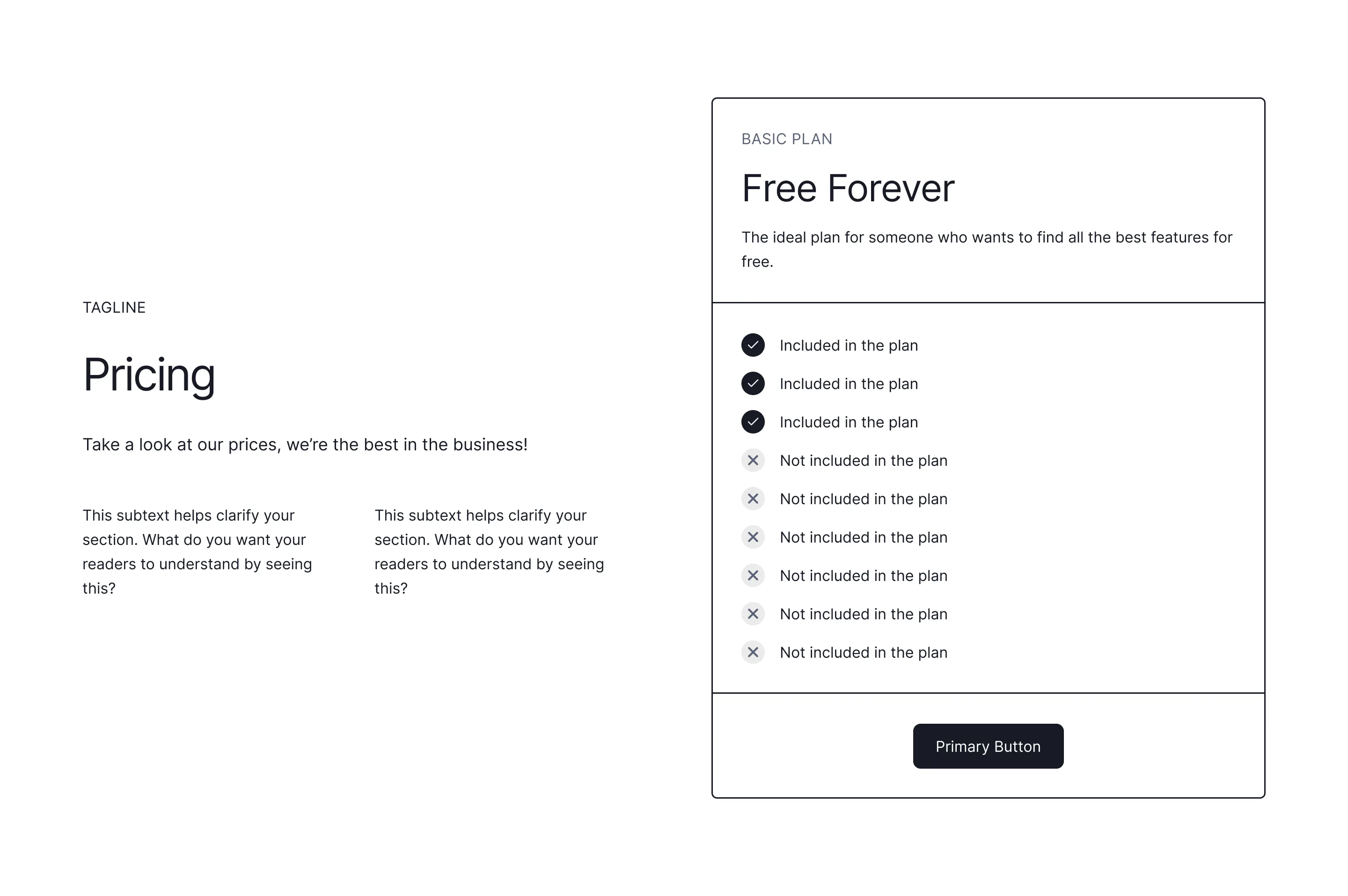
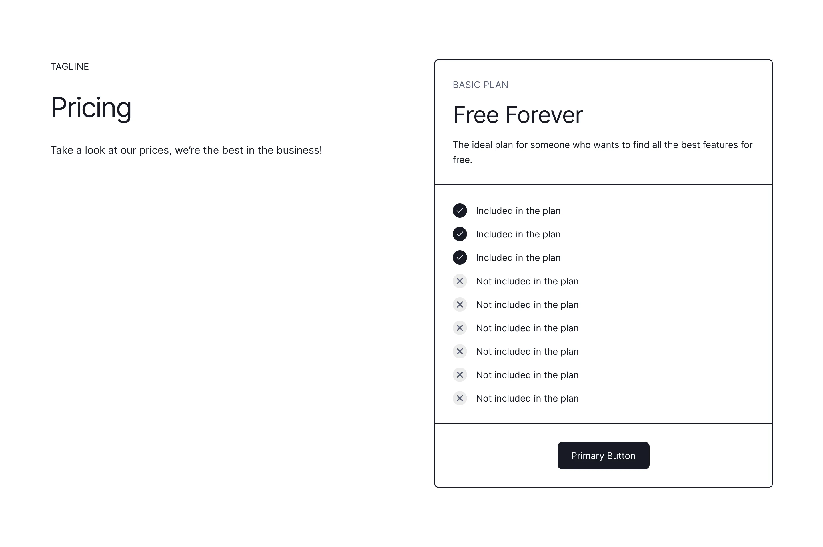
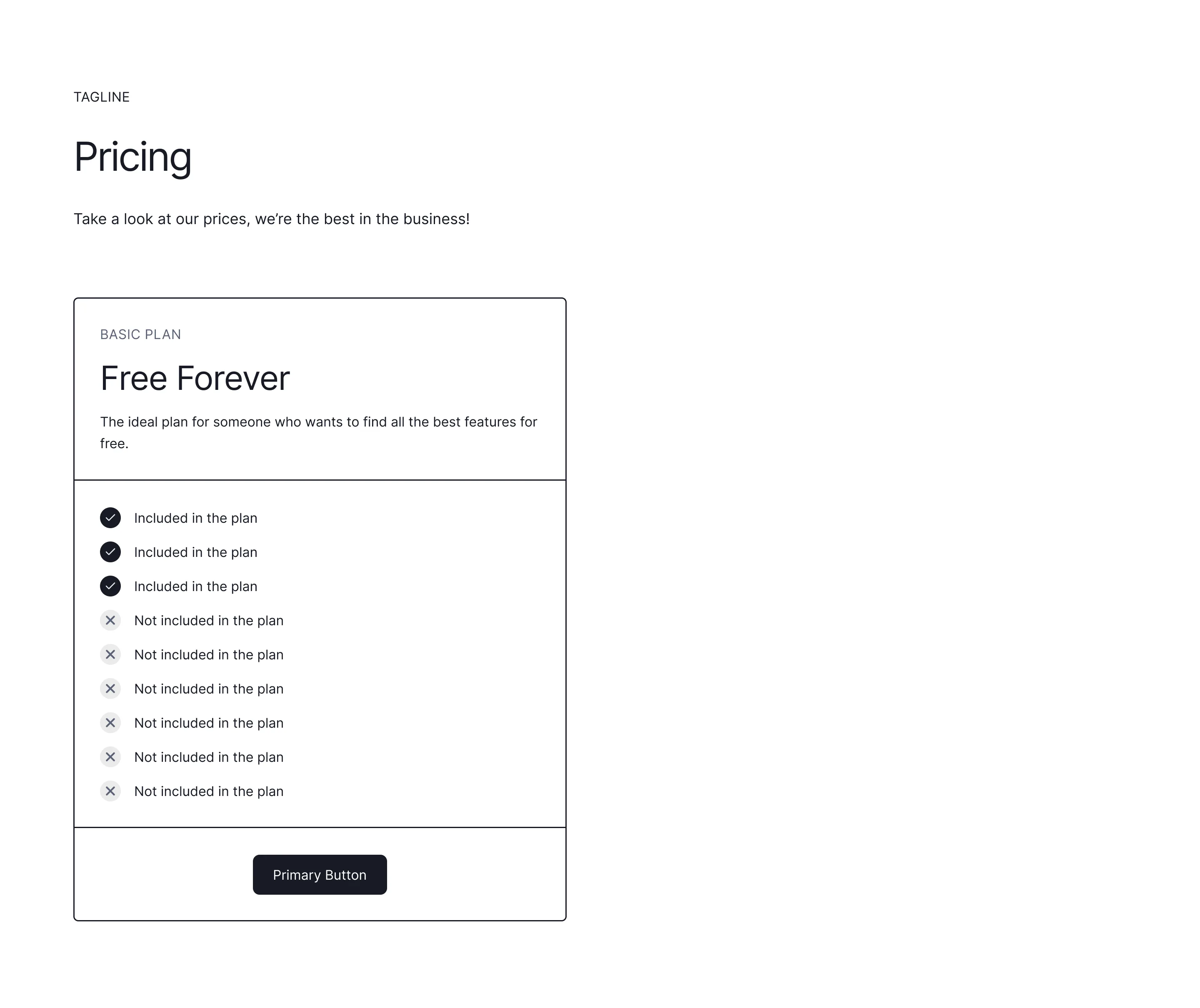
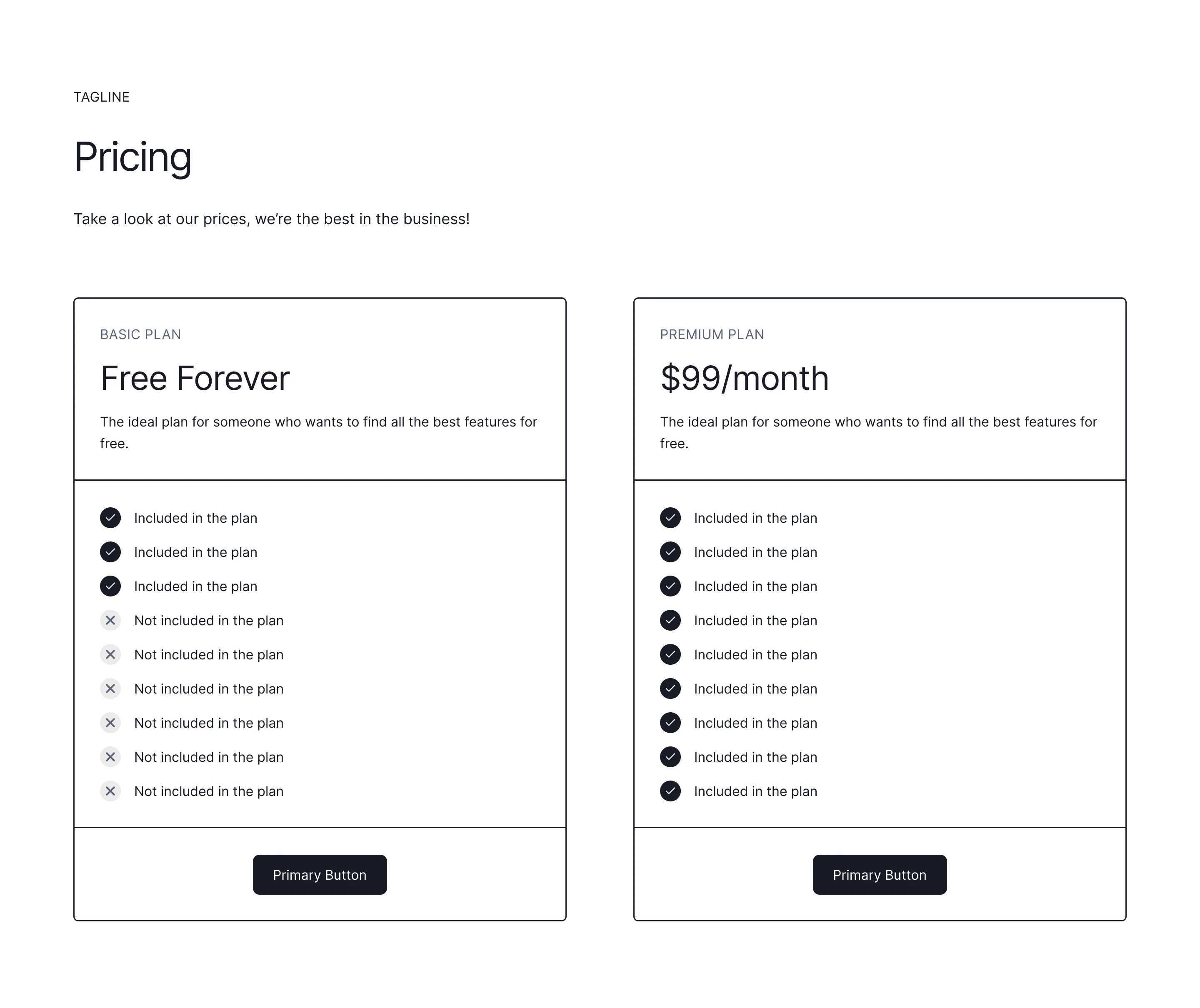
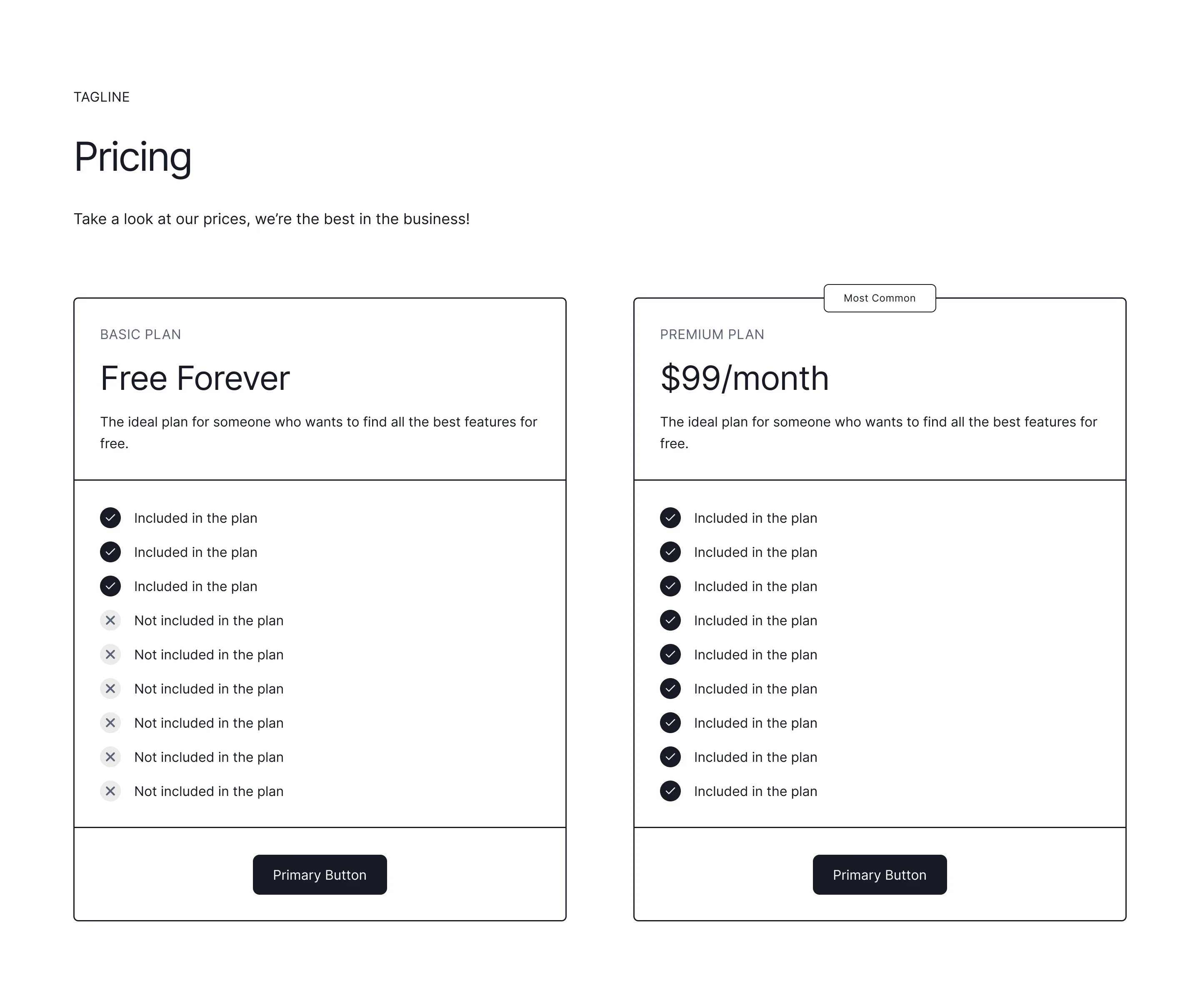
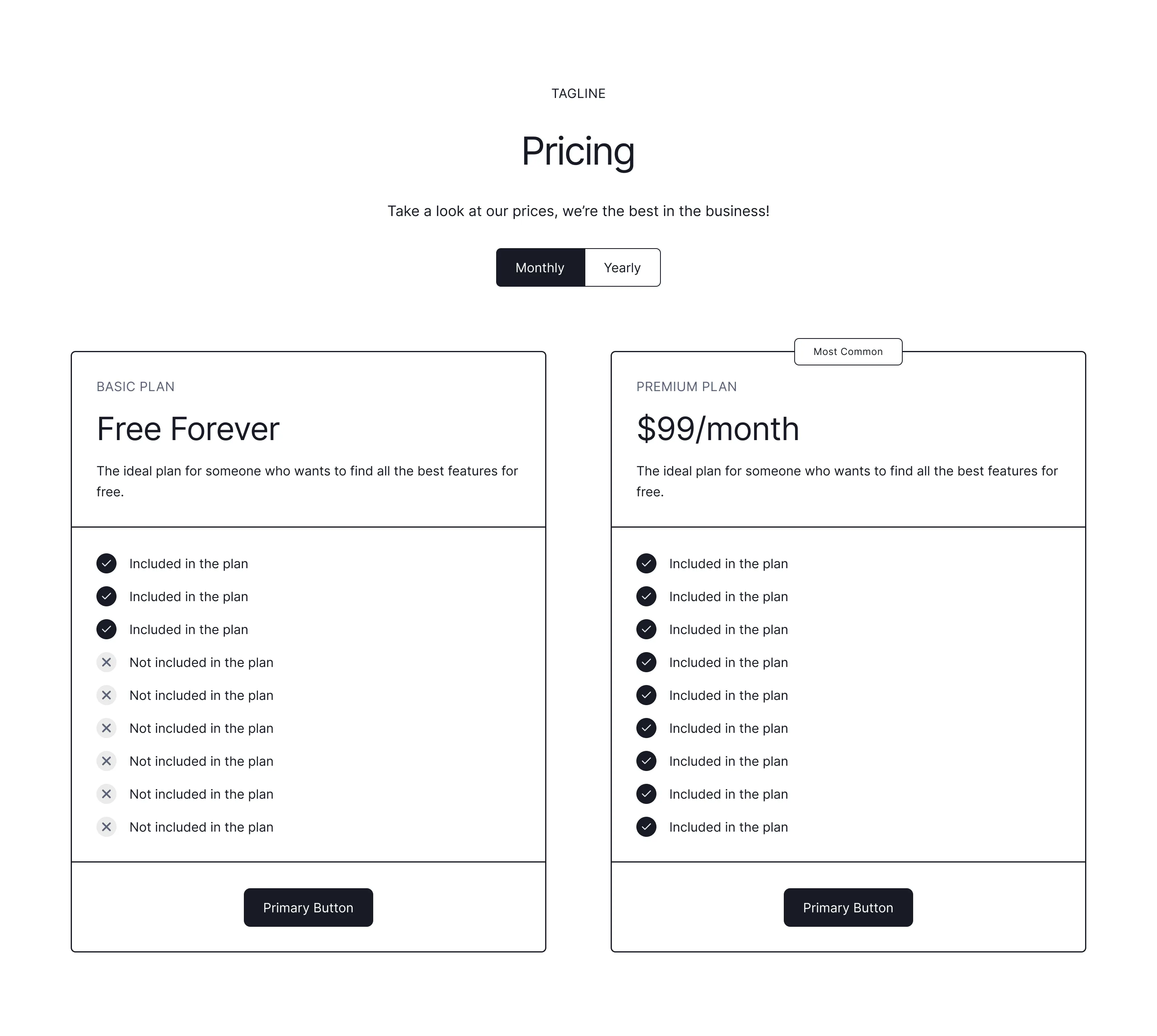
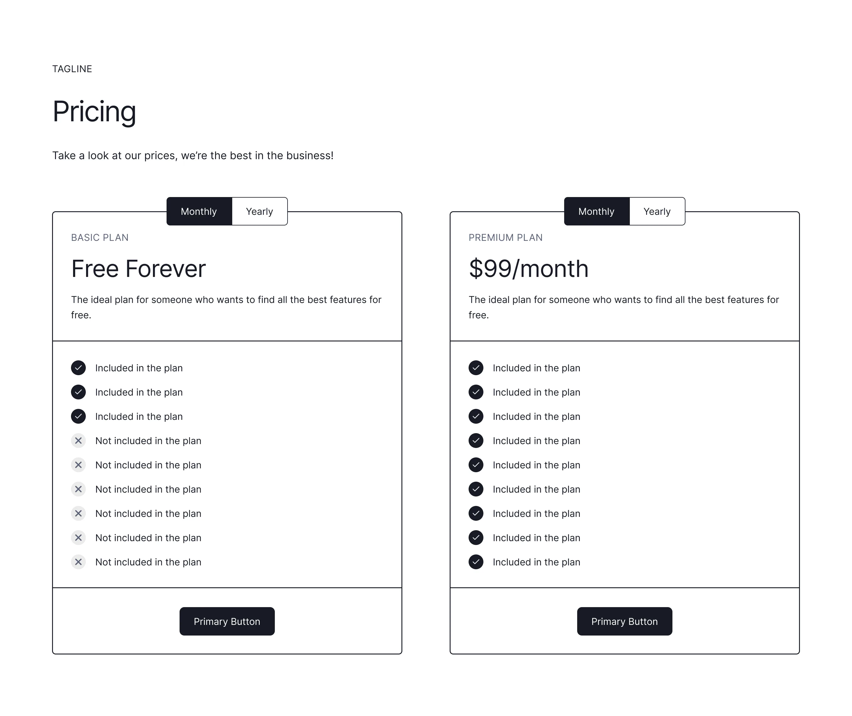
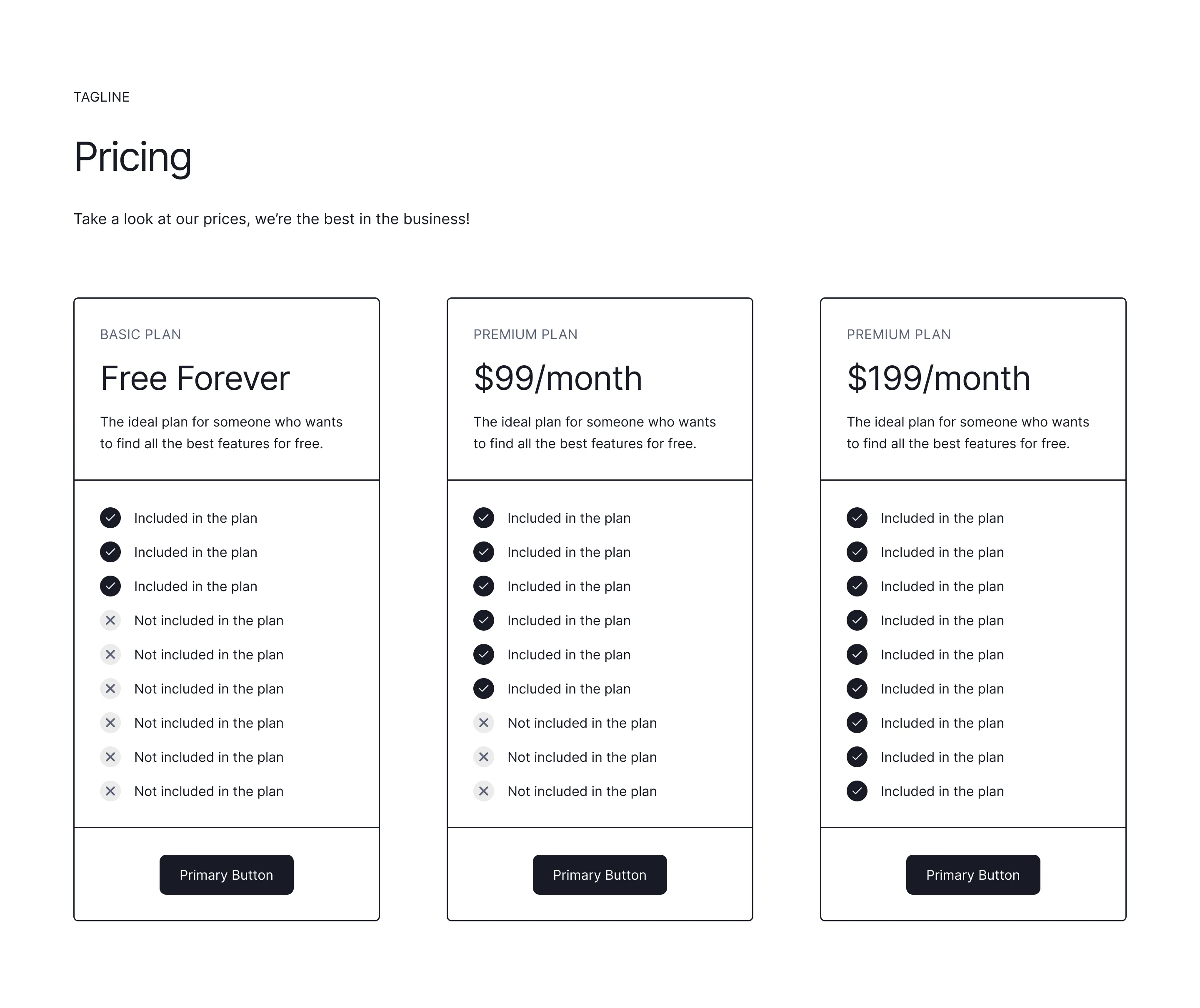
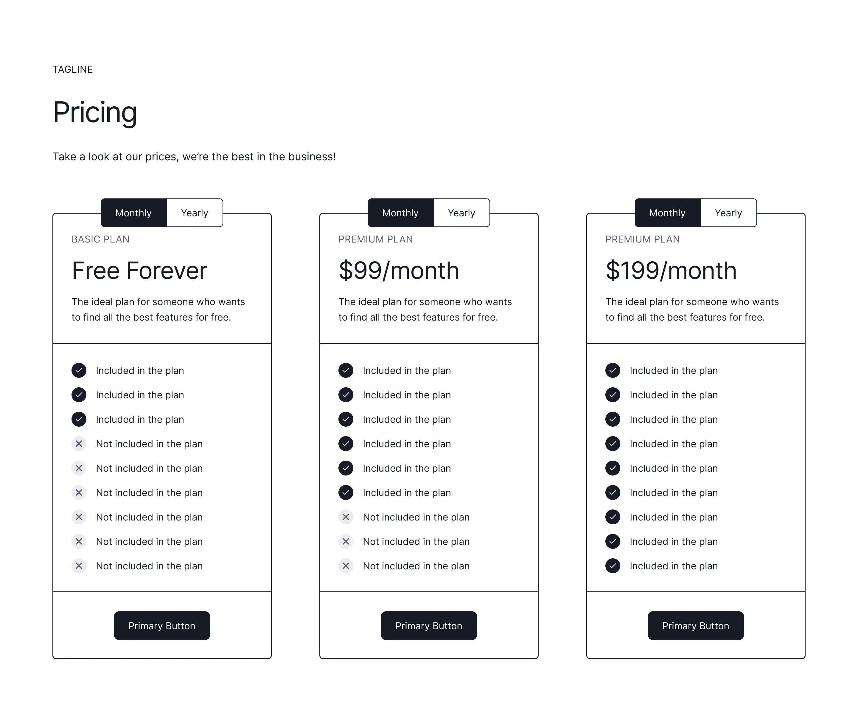
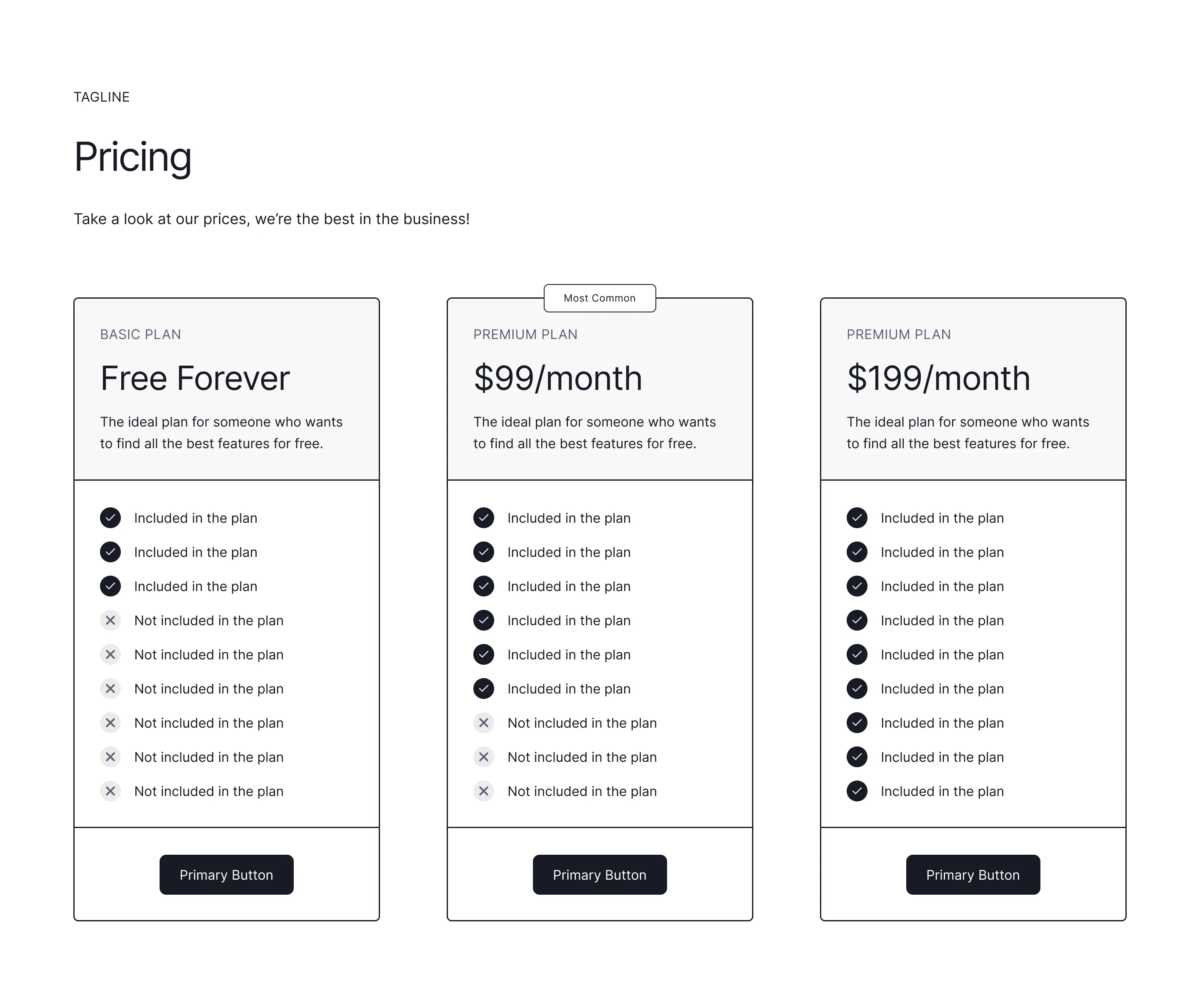
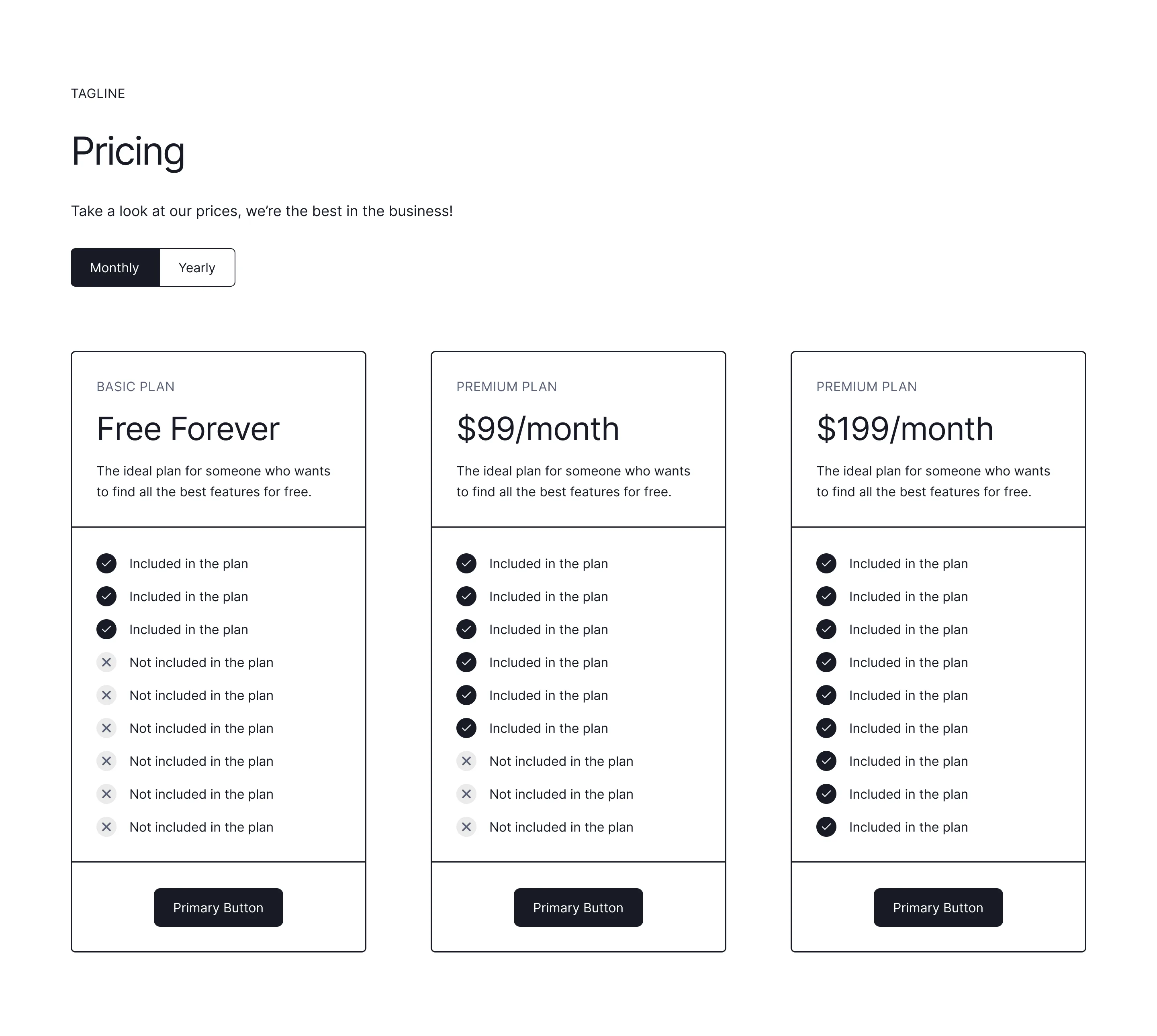
A pricing section is a comparison tool, not a brochure: three tiers with one visually recommended plan outperforms long feature dumps. Name plans by who they're for, show the annual toggle honestly, and put the FAQ directly underneath to catch the hesitation it creates.
Duplicate any pricing wireframe above into Figma, Framer, or Webflow. Cards, comparison tables, and toggle layouts are all here with alignment and emphasis already worked out, so testing a new structure is a copy-paste rather than a rebuild.
Show fewer features per tier, not more. Buyers compare on the three or four rows that matter to them, and a wall of ticks makes plans harder to tell apart. Keep the full comparison in an expandable table below the cards for the buyers who want it.